i n k l o d e

fountain pens, inks, paper and more

Sailor HighAce Neo

Sailor HighAce Neo

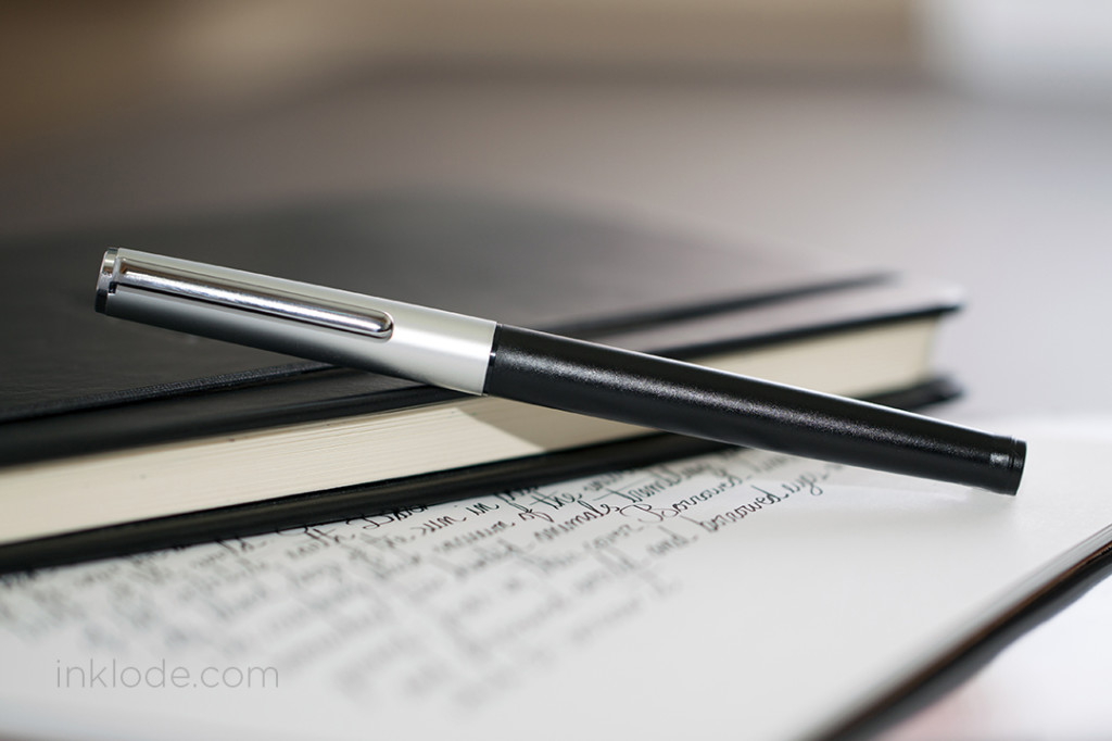
The HighAce Neo is a low-priced, entry-level fountain pen offered by Sailor. In many places, it can be purchased for under $20 (USD) and comes in black, red, green, or blue barrels. The section and cap are always the same color. My first impression was that this pen feels very off balance. The cap is made of a lightweight metal, but the barrel of the pen is made of a super light, cheap plastic. It took me some getting used to, but writing with such a light pen soon became rather effortless and I finally began to appreciate the qualities of the pen that stood out to me.

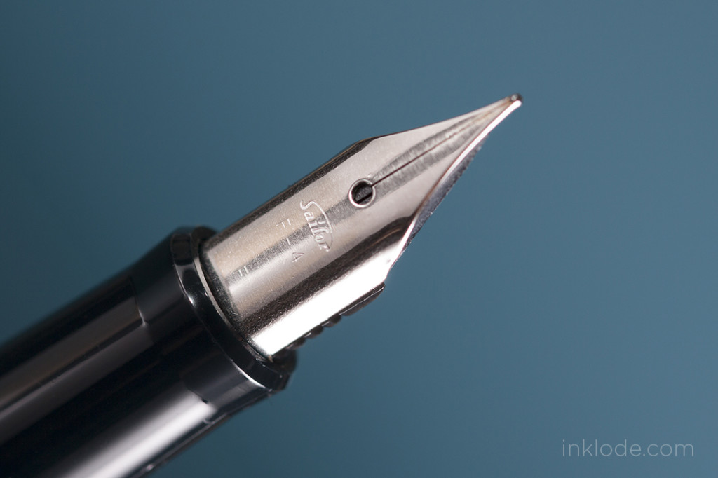
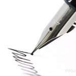
One of the best parts of this pen, for me, is the nib. I am a big fan of Sailor pens and I am glad to see that even their low-priced, entry-level pens are really smooth writers right out of the box. The steel nib is very plain, but its cheap appearance belies the writing experience it can provide. There is little to no flex with this nib as it was not designed for flex writing. The nib itself is clean with only the brand, the nib number, and size.

Sailor_HighaceNeo_03

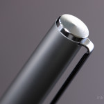
One feature I liked was that the cap can snap on to both the front and back ends of the pen alike so you can be sure it is securely attached. When posted, the pen becomes heavily off-balance due to the cap being made of metal. I found the weight difference to be perturbing enough to disrupt my writing experience. The pen is comfortable enough to write with sans posted cap. The barrel of the pen looks really narrow, but surprisingly the pen is still quite comfortable to hold. The grip section is made of smooth plastic as opposed to the rest of the body which has some texture to it, but I had no issues with slipping or losing my grip. Personally, I prefer pens with a larger barrel diameter so extended periods of writing were not ideal in comfort.

That being said, the Sailor HighAce Neo is a great, affordable, entry-level fountain pen that still manages to bring a smooth writing performance. It may not be the most durable or long lasting pen in your arsenal, but for a quick pen to toss in your bag for every day writing, I think it can stand on its own.

Nib material: Steel

Cap: Snap

Filling mechanism: Cartridge/Converter (Sailor)

Overall Length: 136 mm

Weight: ~10.6 g

Like what you see? Subscribe to our newsletter!

J. Herbin Bouquet D’antan

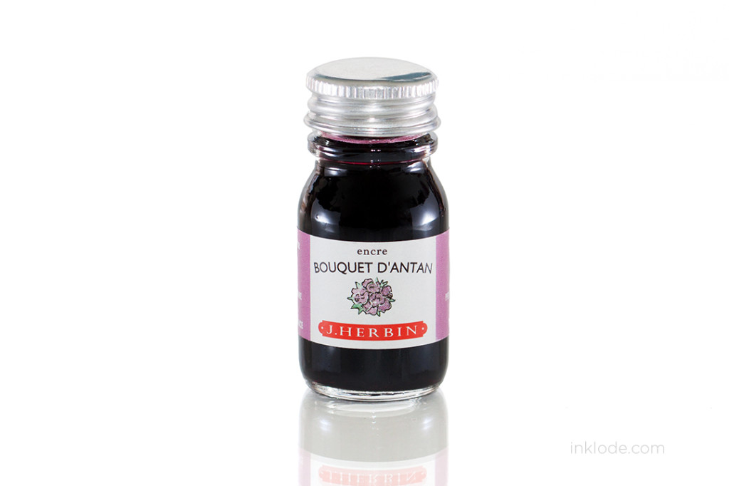
J. Herbin Bouquet D'antanJ. Herbin Bouquet D'antan 10 oz bottle

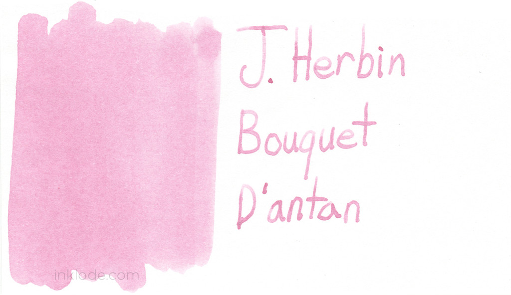
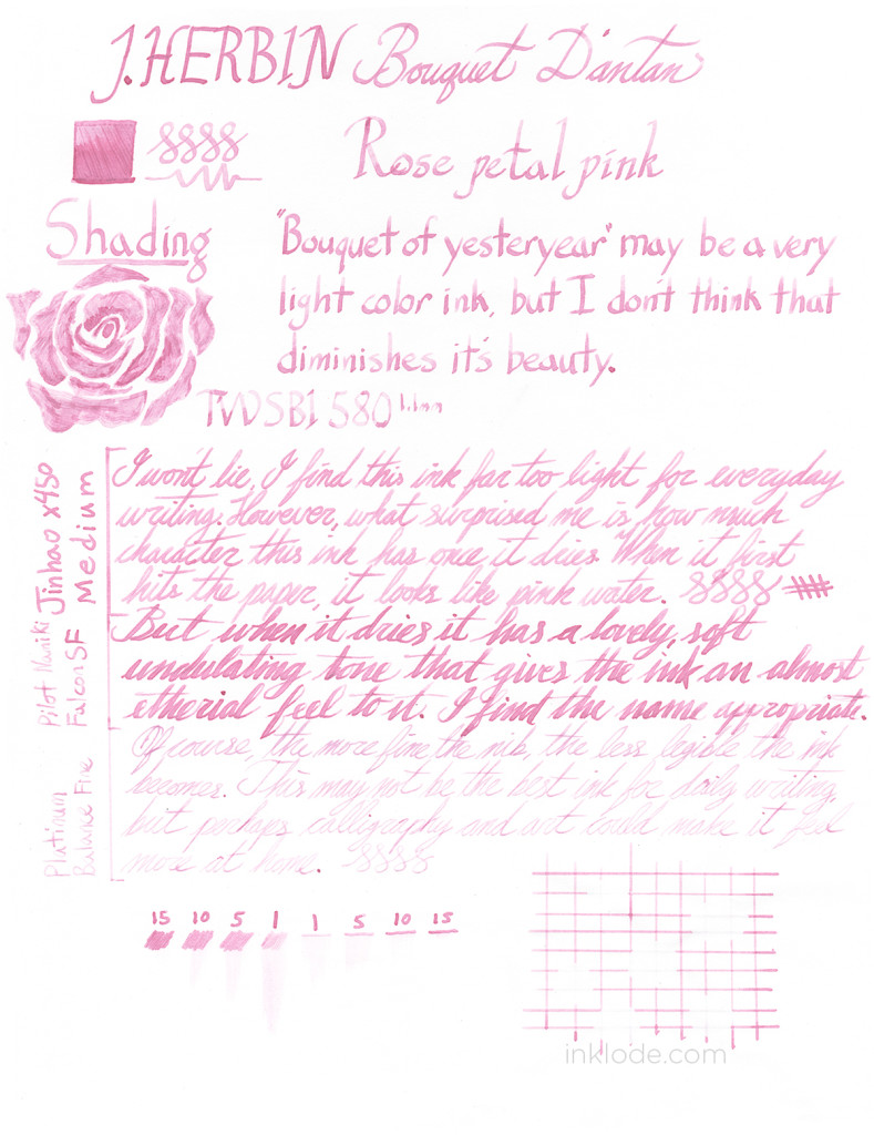
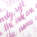
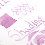
J. Herbin’s Bouquet D’antan is a very soft, light pink color that has a bit of an antique nostalgia feel to it. The ink, in my opinion, is not dark or saturated enough for every day writing. It is very easy for writing to become illegible if you are using a pen that is a bit more fine. That being said, I was surprised at how saturated the color can get. The ink goes down on the page like water, but as it dries the color really starts to shine through. There is something about this pink color that feels distantly warm, like a cherished memory in the back of your mind. Parts of it have faded, and may not be entirely clear for those who were not there at its creation, but you remember it well.


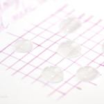
Dry times are adequate, though when it smears you can barely tell anyway. This is definitely not a waterproof ink and it becomes barely visible when exposed to water. Writing with a flex nib and really laying down a lot of ink, you can get the color saturated enough to be quite legible. However, if you are looking for a pink ink for every day writing, I would suggest looking elsewhere. Still, if this ink is to be used for artistic purposes or in situations that calls for a lovely light pink color, Bouquet D’antan is an excellent choice.


JHerbin_Bouquet_Dantan_review


Noodler's Air Corp Blue-BlackNoodler's Air Corp Blue-Black bottle

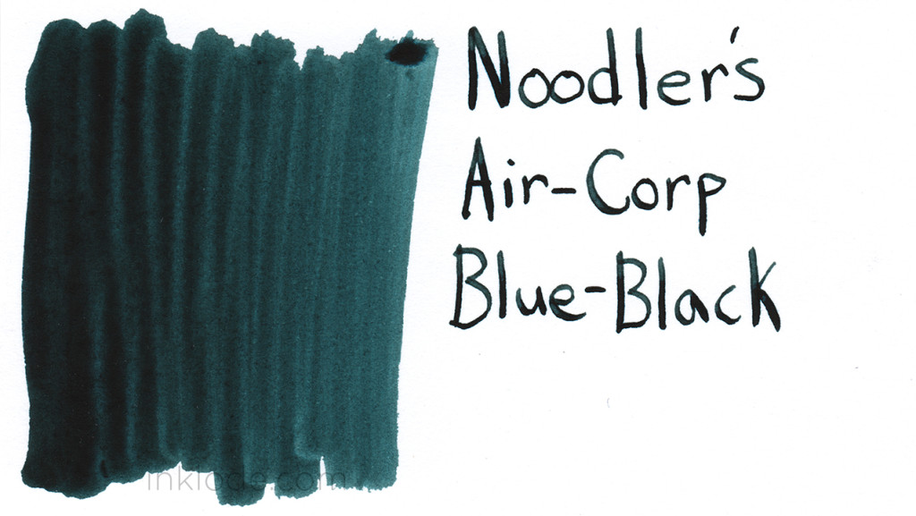
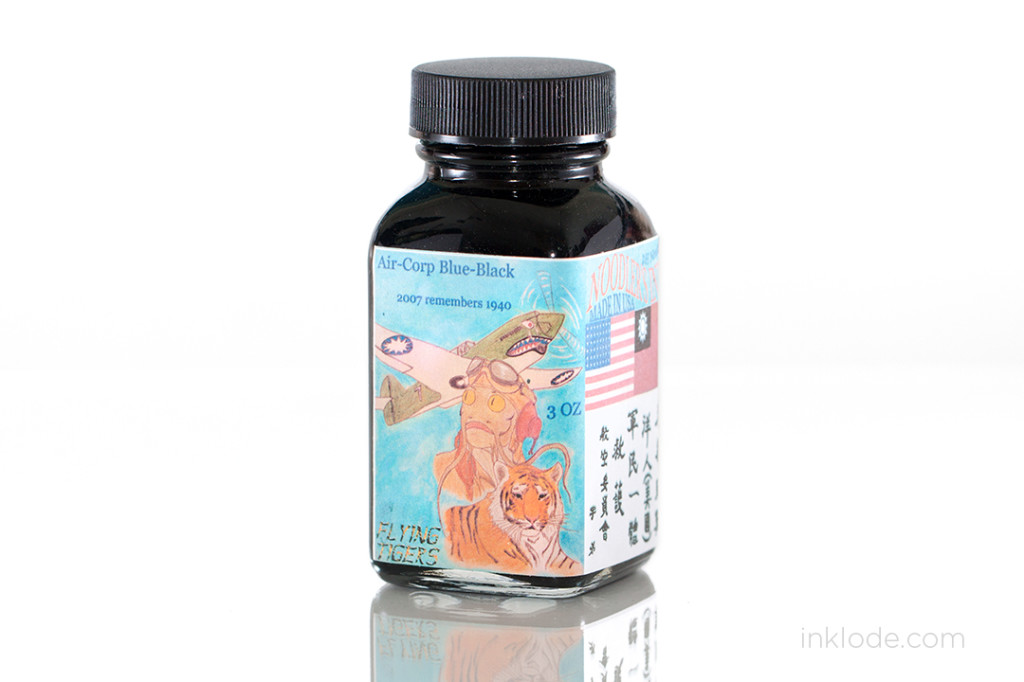
Noodler’s Air Corp Blue-Black is a very dark blue-black ink that tends to lean towards the black end of things, but the blue that peeks through has a hint of green hue to it. The ink also belongs to the bulletproof line of Noodler’s inks and is very resistant to water. However, I did notice in my water tests that the blue tends to wash away leaving only the black hues of the ink in place. The flow is pretty good with only minor railroading in my Pilot Namiki Falcon if I push the flex. Small amounts of bleeding on Rhodia if you really pool the ink, but otherwise it’s not an issue. Interestingly, on the rare occasion that it does bleed, only the blue color seeps through while the black does not. Overall, I would say that this is a great ink that can be good for daily use as an alternative to a more traditional black, blue, or blue-black ink. The fact that it is also bulletproof definitely gives it an edge on many other blue-black inks on the market if you’re looking for staying power. I definitely recommend it!

Note: I apologize for putting the words “Air Corp” together in my review.


Noodler's Air Corp Blue-Black review


Like what you see? Subscribe to our newsletter!

Sailor Jentle Miruai

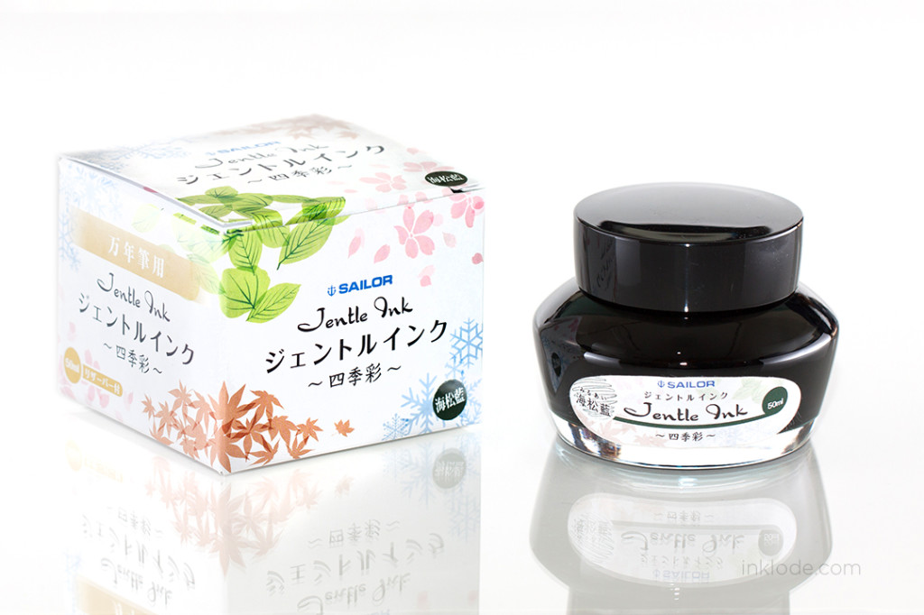
SWAB_sailor_miruaiSailor_Miruai_bottle

Sailor Miruai was released several years ago as a limited edition part of Sailor’s “Spring” line of inks. The color quickly gained popularity and was missed by many people when supplies were finally depleted. Thankfully, in early 2014, Sailor re-issued several of the most popular limited edition seasonal inks to be added as a part of the normal Jentle line-up. Sailor Miruai was among the most anticipated of the returning inks of the line.

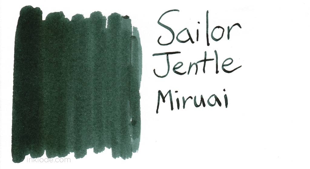
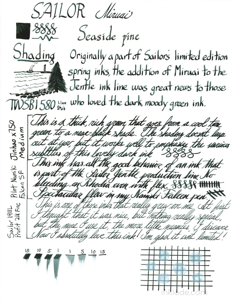
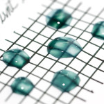
Miruai means, “Seaside Pine Blue,” and the color definitely evokes such an image. Miruai has a cool tone to the green with a hint of blue that makes it a lovely blue-green ink. The behavior is on-par with the quality of the Sailor Jentle line and is well behaved with no bleeding or feathering on Rhodia. While the ink is not waterproof, it does exhibit some staying power after being exposed to water and retains a bit of legibility. The shading is subtle, but it transitions from a cool blue-green to a very dark green (almost black) color and the result is quite lovely. I find the ink to be calm and pensive. Along with the name of the ink, I envision a cool, early fall morning amidst the scattered pines along a rocky beach. The ocean breeze is chilly, but strangely comforting as you lose yourself in your thoughts.

Sailor Miruai review

Like what you see? Subscribe to our newsletter!
2014 Seoul Pen Show


2014SeoulPenShow_01


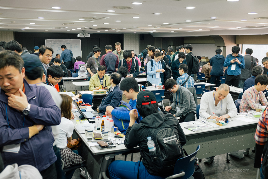
I had the opportunity to check out the Seoul Pen Show this year hosted by the tight-knit online community, Penhood.


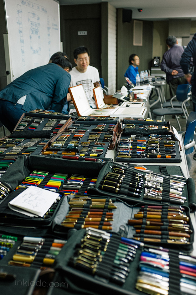
The show was held in a small conference room near the heart of Seoul, South Korea. Despite the small size of the room, the show was bustling! There were tables full of beautiful vintage pens on display and people were crowding around to test out some of their most sought after pens. It was great to see the level of interest in fountain pens here in Korea, and the show was much busier than I imagined it would be. I definitely think they could have upgraded to a slightly larger room because navigating the narrow spaces between the tables started to become very difficult as people came and went. However, the lighthearted atmosphere of people coming together to discuss their love of fountain pens and inks is lovely sight to behold. Sadly, I couldn’t spend much time at the show, but I had a great time looking around and talking with a few people. I look forward to next year!


2014SeoulPenShow_05


Like what you see? Subscribe to our newsletter!
Lamy Safari


Lamy Safari

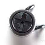
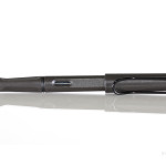
To many, the Lamy Safari is one of the quintessential “starter” pens for those seeking to step into the wide world fountain pens. It is affordable, well constructed, and has a relatively high availability in most countries. My own Lamy Safari is a bit weathered (well, at least the nib is), but it is still going strong!

Lamy Safari

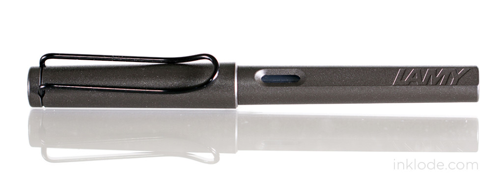
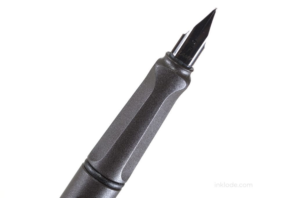
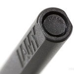
The Lamy Safari comes in a wide variety of colors. Some of those colors are actually limited editions made for one specific year (though some of those colors are repeated in later years), but the simple format of the pen itself never changes. There is also a clear (demonstrator) version of this pen which is often referred to as the Lamy Vista. My personal color of choice was the charcoal gray with matching trim. The body is made of a hard resin that has been given a textured surface (note: most Safari models are not textured but rather smooth plastic) which helps you keep a good grip on the pen and also adds a bit of character to it as well. Along the sides of the pen is an open-air ink window on either side, and the words, “LAMY” on one side. The pen is light, but it does not feel cheap. When posted, the pen feels a bit back-heavy and I find it more comfortable to write without the cap. The resin feels strong and does not flex if you squeeze it. Unlike some of the cheap knockoffs, the Lamy Safari feels like a pen that is built to take some abuse.

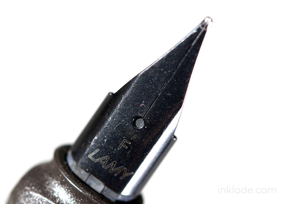
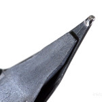
The nib is made of steel and can be very smooth if you find the sweet spot. Deviate too much, though, and it can give a lot of feedback depending on the type of paper you are writing on. There is really no flex to the nib at all, and it definitely was not meant to be flexed. One of the great features of these pens is how incredibly easy it is to switch nibs. Simply grip the nib from both sides and give it a gentle tug away from the pen and it slips right off. Lamy sells replacement nibs in Extra Fine, Fine, Medium, Broad, 1.1 mm, 1.5 mm, and 1.9 mm.

Lamy Safari

One of the more polarizing aspects of the pen, for some people, is the grip section. The grip section is molded to aid in keeping a proper writing grip on the pen. Some people like it, others do not (personally, I don’t like it). However, overall the Lamy Safari has made quite a name for itself and it continues to be among the first pens suggested to beginning fountain pen users (for good reason). I think it is a great pen and a stepping stone into a larger world.


Nib material: Steel

Cap: Snap

Filling mechanism: Cartridge/Converter (Lamy Z24)

Overall length: 144 mm

Lamy Safari nib size comparison


Like what you see? Subscribe to our newsletter!

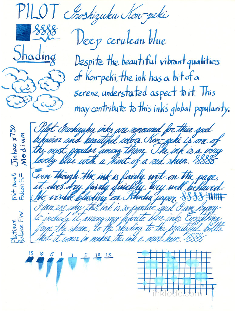
Pilot Iroshizuku Kon-peki

Pilot Iroshizuku Kon-pekiPilot Iroshizuku Kon-peki


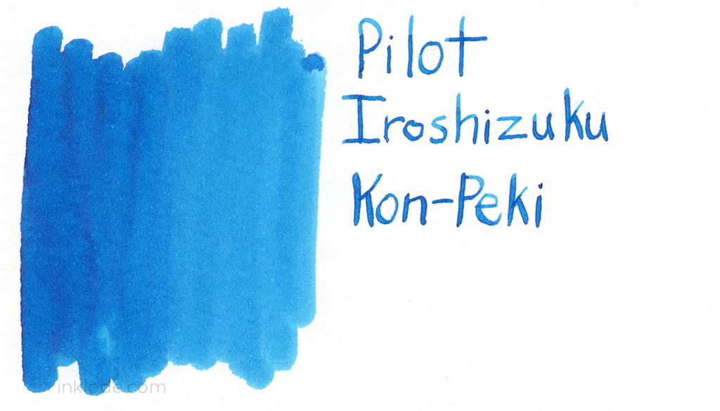
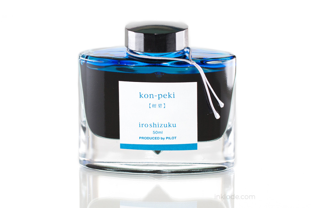
The Pilot Iroshizuku line of inks are well known for their vibrant colors and all-around well-behavior. So it is no mystery that Kon-peki has found its way onto the shelves of many fountain pen users. This highly praised ink is a beautiful, bright blue color reminiscent of a warm summer sky. Water resistance is poor and the ink becomes barely legible when exposed to water. Like most of the Iroshizuku line of inks, Kon-peki flows well in most pens and puts down a lovely wet line. I get no bleed through on Rhodia paper, even with heavy flex writing. The lovely shading does well to give the ink a playful feel and the hint of a red sheen adds a little something special that makes this ink a must have for anyone who loves bright blue inks.


Pilot Iroshizuku Kon-peki Review

Like what you see? Subscribe to our newsletter!
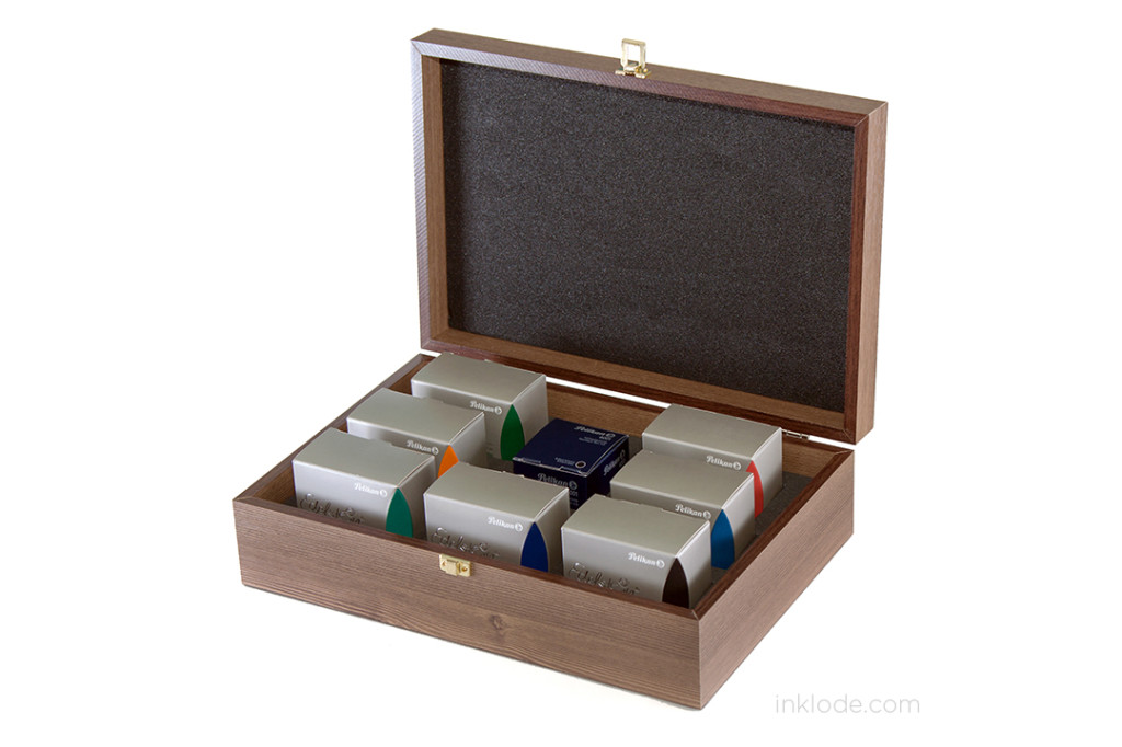
Pelikan_Edelstein_box_set_01

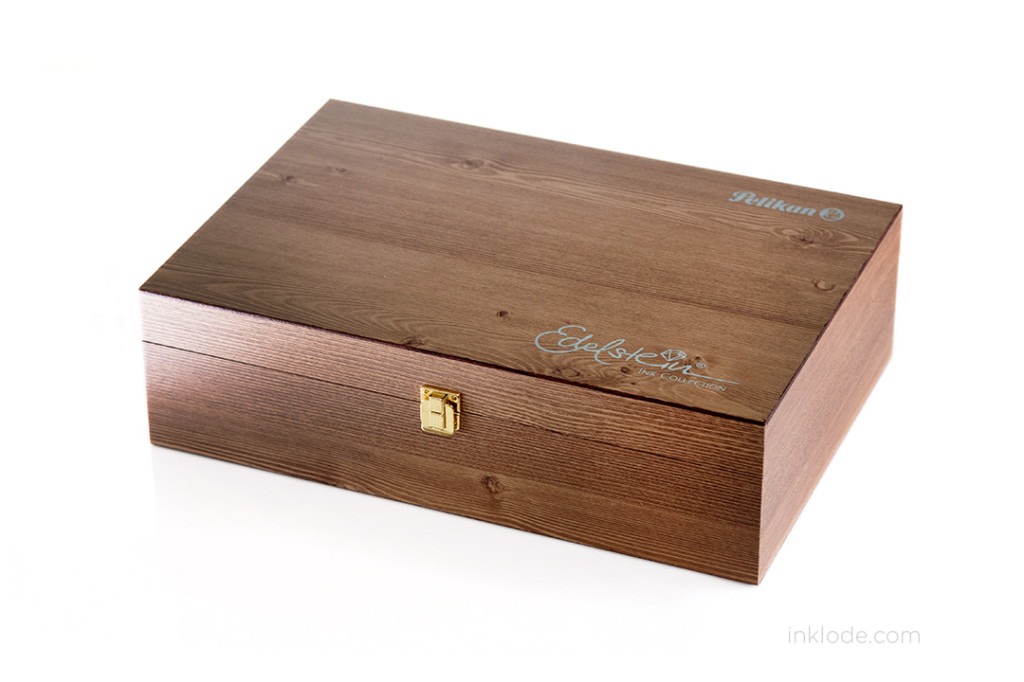
I was looking to purchase a few Pelikan Edelstein inks when I noticed that the stores in my area were selling a “Limited Edition” wood box gift set of the inks. Considering the price of the individual ink bottles, the added cost of the box itself was negligible so I decided to go for it and pick it up.

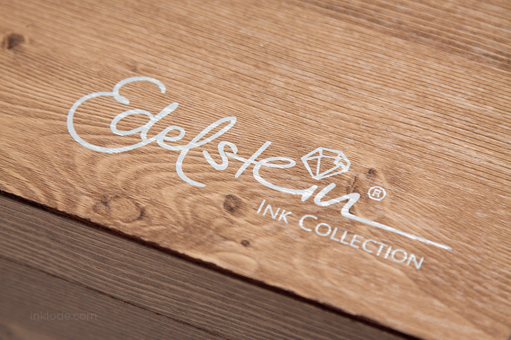
Pelikan_Edelstein_box_set_02


Upon further inquiry, the box itself is not actually an official product sold by Pelikan, but rather a limited edition packaged set sold by certain retailers in Asia. My local shop informed me that the box itself is manufactured in China before being shipped to select retailers for packaging the inks. Regardless of its origin, the construction of the box was surprisingly high quality. The box itself is sturdy and the foam inserts are stiff and protective. I feel confident that this box will be more than sufficient for storing and protecting my Edelstein inks.


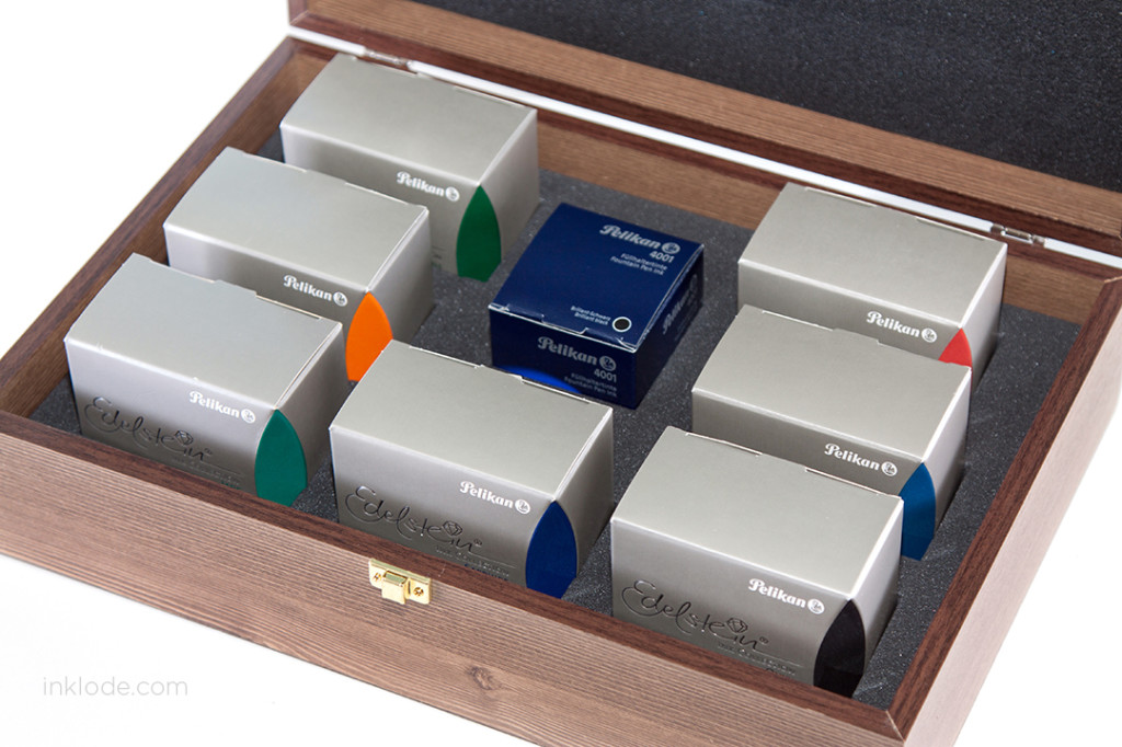
Pelikan_Edelstein_box_set_05

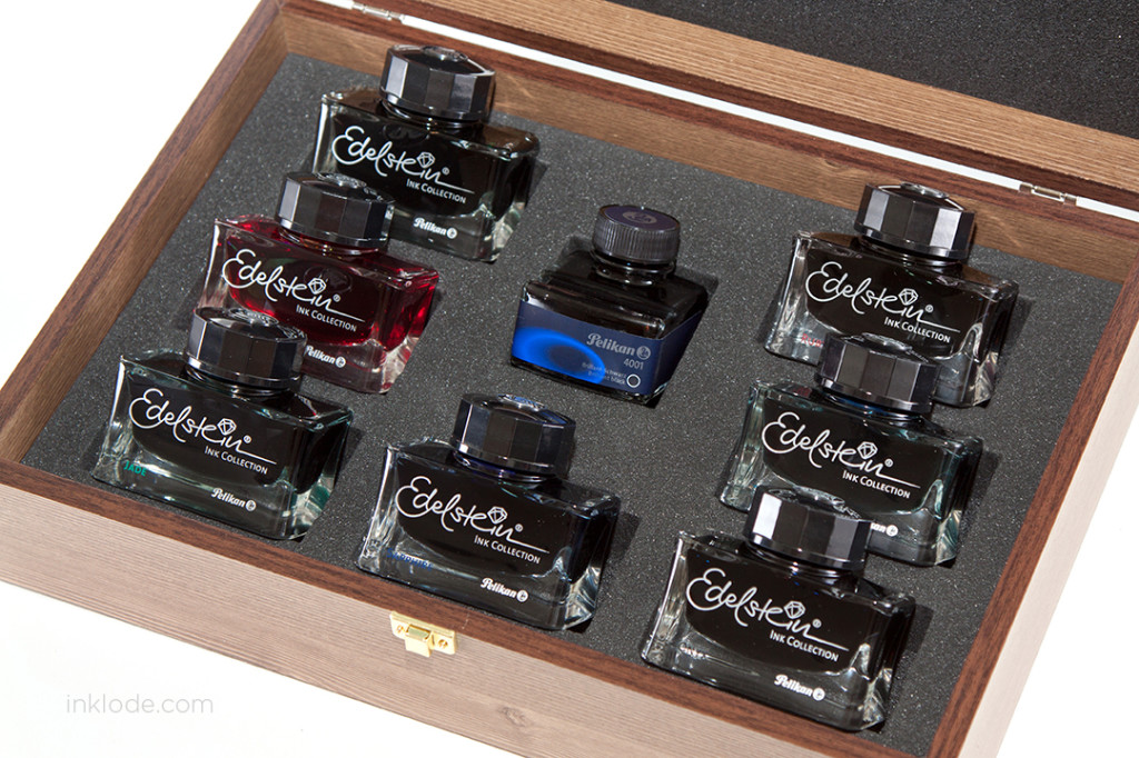
The boxed set came with an (almost) complete collection of the Edelstein ink line.

The inks included are:

  • Onyx
  • Sapphire
  • Topaz
  • Jade
  • Aventurine
  • Mandarin
  • Ruby
  • Pelikan Brilliant Black 4001


Pelikan_Edelstein_box_set_03

Pelikan_Edelstein_box_set_04

I personally think that the packaging is very fitting for the renowned beauty of the Edelstein bottles. My only lament is that there is no slot for Tanzanite which was presumably released after the creation of this packaged set. However, it is still a lovely way to store my Edelstein inks and I am very happy to have it as a part of my collection!

Like what you see? Subscribe to our newsletter!
Waterman Intense Black

Waterman Intense BlackWaterman Intense Black bottle


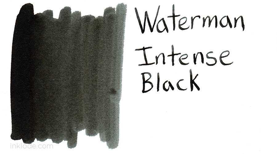
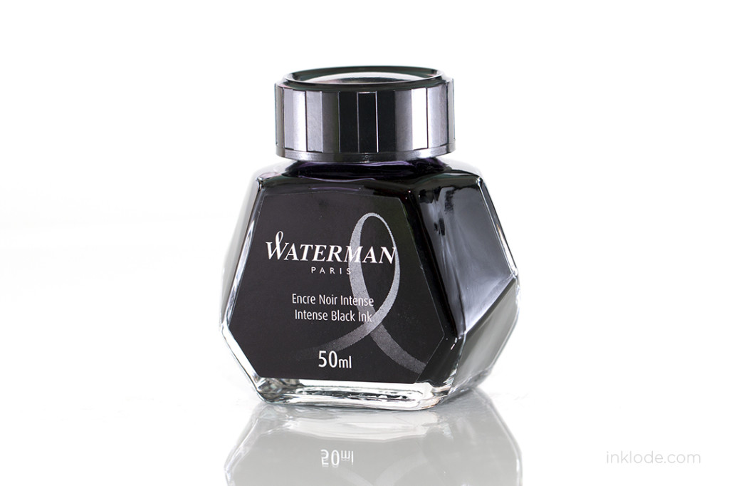
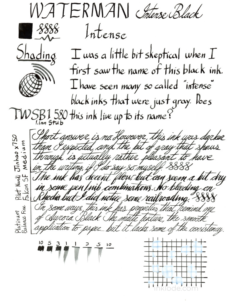
Though I was surprised by how dark this ink can actually get, normal writing with this ink tends to lean towards the gray side. The ink is well behaved and is a good solid black, but if you are seeking an ink that is truly intense and unwavering, this is probably not your black ink. It is not very water resistant so I would be hesitant to use it on important documents, but it is definitely reliable in many other ways, and I could see it being used for every day writing for notes and the like. This cooler toned black has no outstanding qualities, but is nonetheless a decent black ink.

Waterman Intense Black Review

Like what you see? Subscribe to our newsletter!
Montblanc Lavender Purple

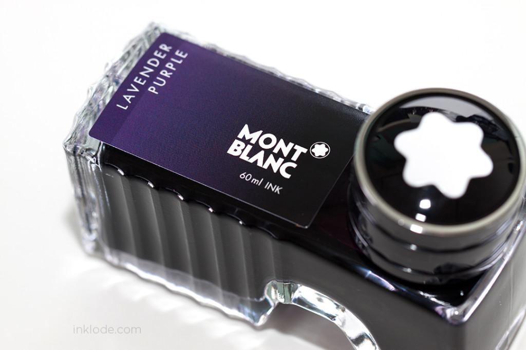
Montblanc Lavender PurpleMontblanc Lavender Purple bottle


Montblanc Lavender Purple went through a bit of an ordeal in late 2013 as it was pulled from shelves, much to the consumers confusion. Reports and speculations poured in and many incongruous theories popped up as to why it was disappearing. Some said they heard it was a viscosity issue, other reports said the formula was being altered for color sustainability, and some even heard the ink was going to be discontinued. Regardless of the reason, the loss of Lavender Purple left many Montblanc ink users disappointed. Then in early 2014, Montblanc quietly re-released the Lavender Purple ink and it started to work its way back into the stocks of suppliers. The ink made its return as if nothing had happened, much to the joy of those who love a delicious, warm purple ink.

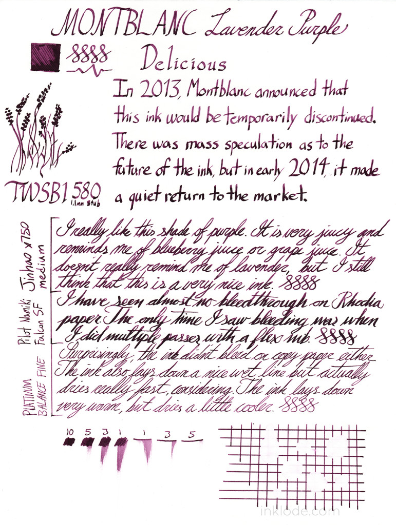
Although I find the name of “lavender” to be a bit misleading, the ink is a very beautiful and juicy shade of purple. It reminds me of the juice from blueberries or a deep grape color. The color is warm and inviting and it lays down on the paper with some lovely shading. Lavender Purple is very well behaved like most Montblanc inks, and I did not get any bleeding with normal writing on Rhodia or copy paper. The dry time is surprisingly fast, but exposure to water pretty much obliterated the ink from the page. Overall, I would definitely recommend this ink if you are looking for a reliable, warm purple ink.

Montblanc_Lavender_Purple_review


Like what you see? Subscribe to our newsletter!