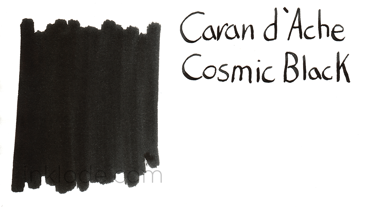
Caran d’Ache Cosmic Black
- By Adam
- In ink
- With One Comment
- Tagged with Caran d'Ache Cosmic Black ink review
- On 16 May | '2015


A lot of people were sad to see the retirement of Caran d’Ache Carbon Black ink when the Colors of the Earth series was discontinued. When the Chromatics series was announced as its successor, many were enthralled by the packaging but balked at the price tag. Though most have already drawn their own conclusion as to the legitimacy of the price point, I wanted to see how the new Cosmic Black stacked up.
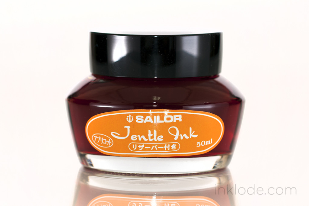
As Cosmic Black was my first bottle of the new Chromatics inks, I spent a few moments to take in the interesting packaging. The glass bottle took on a peculiar shape with a slanted base which (supposedly) allows for easier filling when the ink level gets low. The base of the ink bottle box is constructed in a way that the bottle will sit “flat” while inside it (see photos). Even though the bottle is made of glass, the screw-cap is actually made of a highly polished metal. I found it quite appealing except for the fact that the metal threads inside the cap seemed to have broken off small shards of the glass threads on the bottle at some point down the line before reaching me. However, this did not affect the lids effectiveness in preventing ink from spilling everywhere, so I set it aside and moved on.

So, is Cosmic Black as dark as the center of a black hole floating in the vacuum of space at the heart of a barred spiral galaxy? Well, not quite—but it is certainly a respectably dark black.
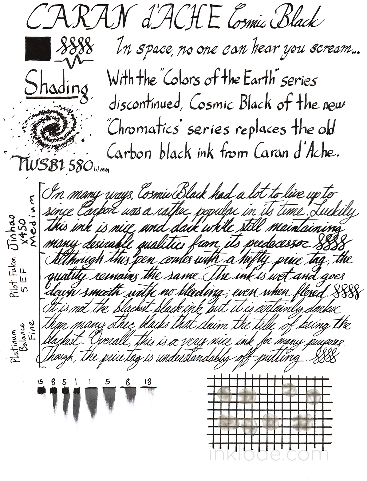
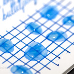
The ink is quite a wet writer and lays down a nice, dark black line. While it is not the blackest black I have ever seen, it tends to lean towards a nice deep black while occasionally straying to a dark gray. The dry times are moderate to long, but it was never enough to cause any problems. There is a very tiny amount of shading if you are in a bright light and hold it at just the right angle, but for the most part it is a fairly straight forward black. When the ink is allowed to pool up a bit, there is a small amount of sheen that can be seen. It is not significant, but does present the ink with a noticeable gloss in the right light. Water resistance is moderate to poor. After exposure to water, the ink smears quite a bit but still remains legible. I found no issues with skipping or flow, and I was very happy to see that the ink was incredibly easy to clean out of my pens (even after a few days of sitting around).
Overall, I would say that this is a very nice black ink and I am more than happy to have it as a part of my collection. However, the price tag is quite high and I do not find any special qualities that justify the extra cost. There are certainly other black inks out there that would fill the needs of most users just as sufficiently but at a much more affordable price. That being said, if you enjoy the fancy packaging and have plenty of money budgeted for your inks, Caran d’Ache Cosmic Black could be a fun purchase.