i n k l o d e

fountain pens, inks, paper and more

Posts in the ink category

Sheaffer Skrip Red

Sheaffer Skrip Red swabSheaffer Skrip Red bottle

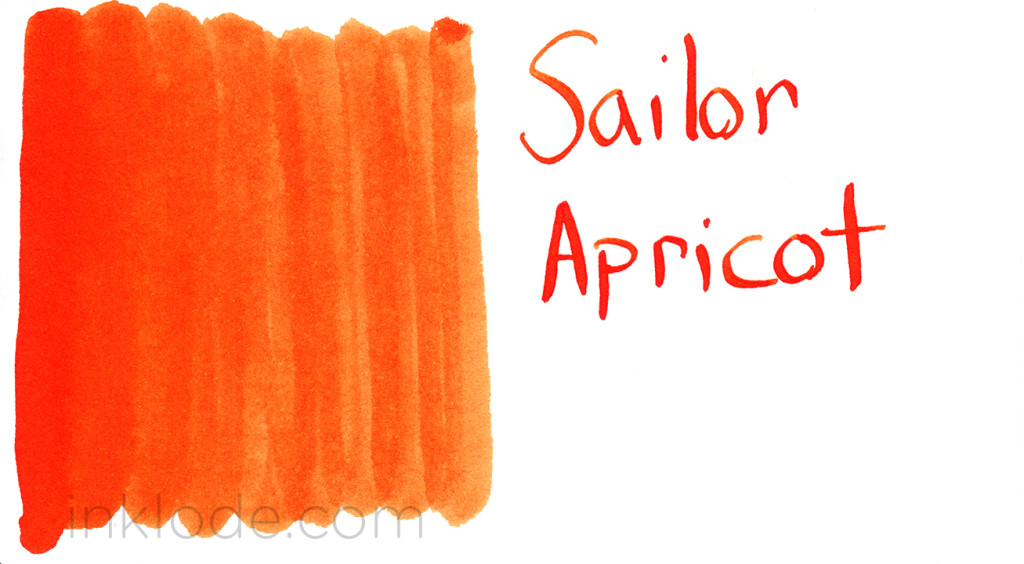
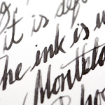
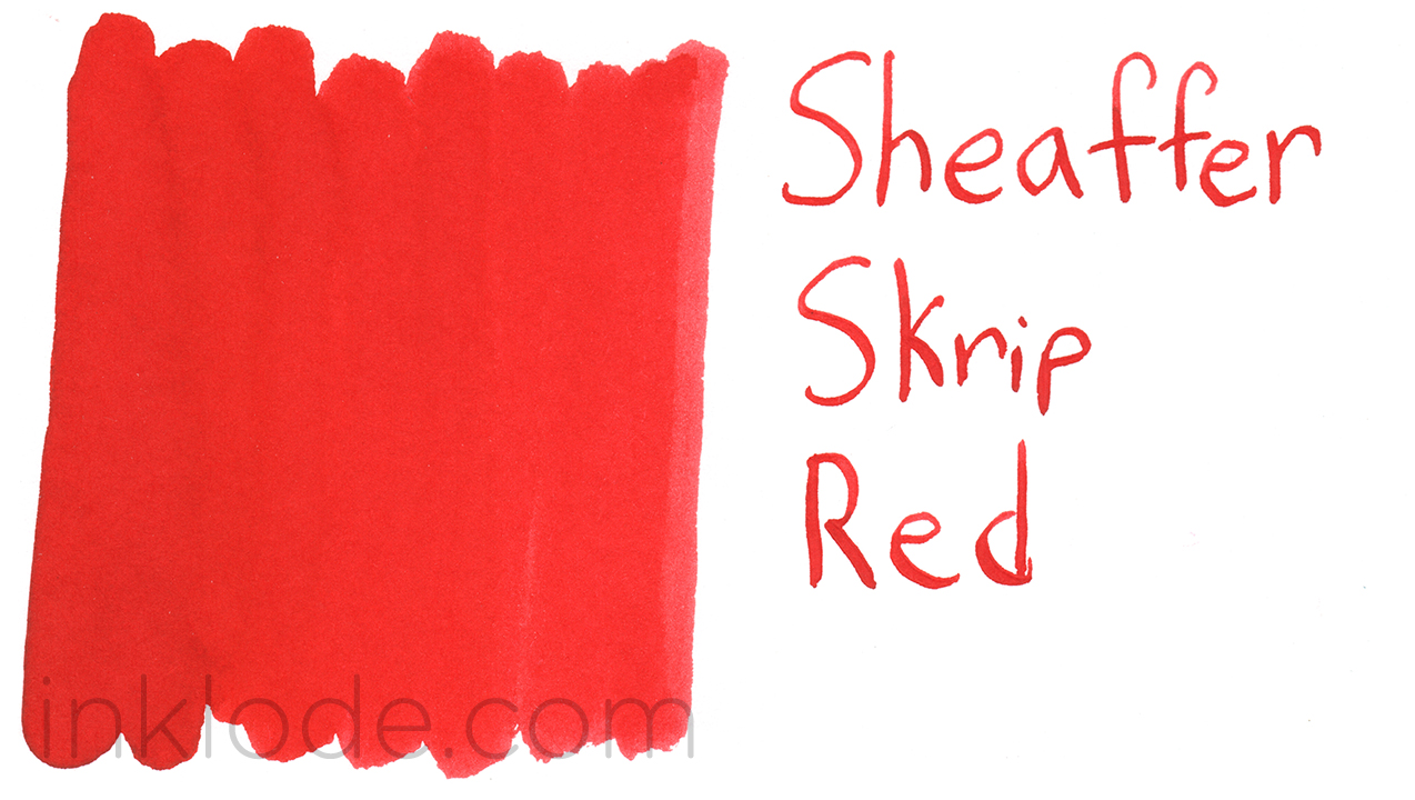
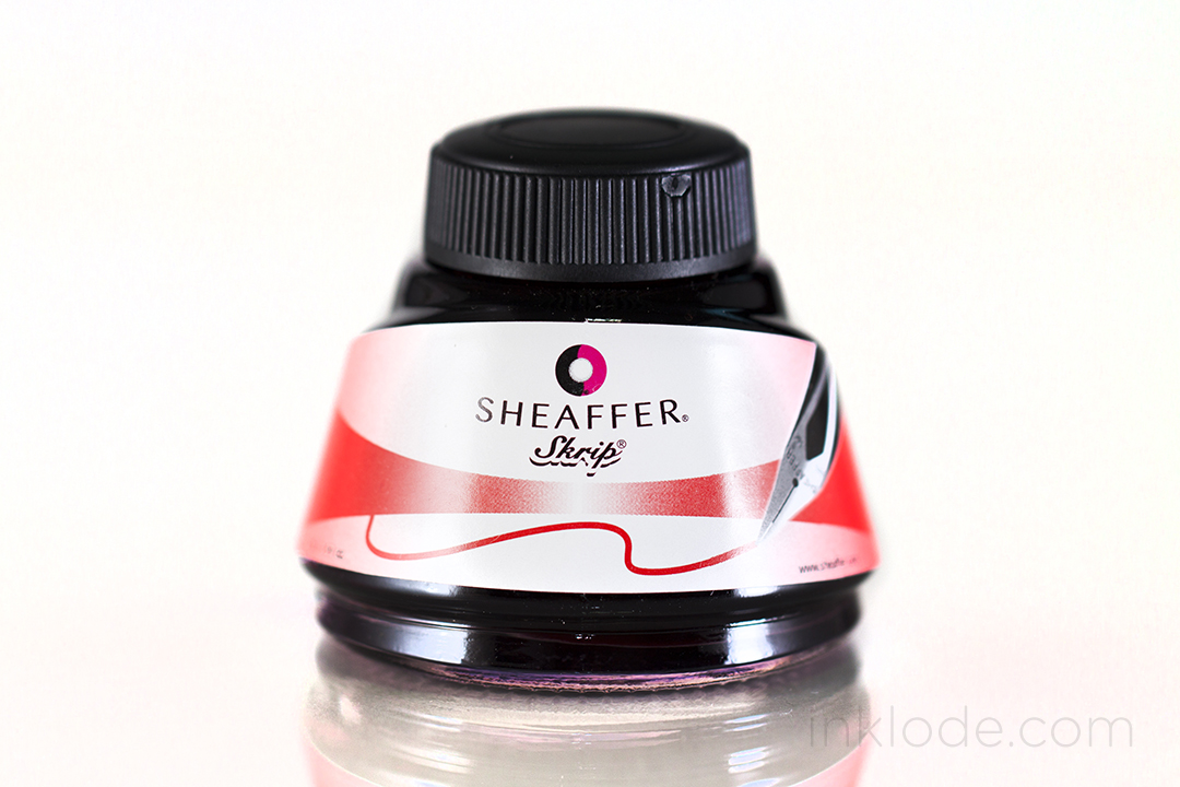
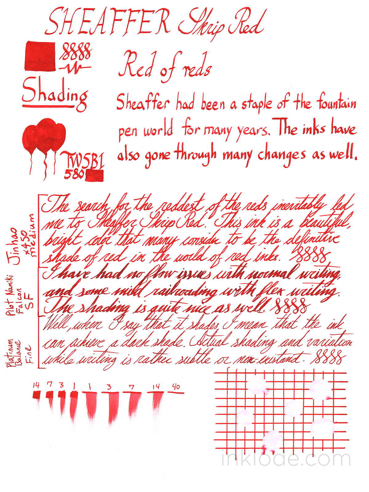
Once upon a time, I embarked on a journey that took me from the solemn vaulted halls of Diamine Oxblood to the burning desert of Noodler’s Cayenne—I examined Pelikan Edelstein Ruby and I basked in Montblanc Winter Glow. Then one day I came upon a simple, unassuming jar of ink. My eyes dismissed the packaging and my hands fumbled with the bottle, but when I finally pressed pen to paper, I knew I had found it—the red of reds. An unwavering beacon of chromatic precision that you could set your watch to. Sheaffer Skrip Red.

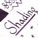
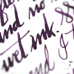
Dramatic hyperbole aside, Sheaffer Skrip Red is one of the best iterations of a basic, no-frills red colored fountain pen ink that I have used thus far. It has a beautiful, bright red hue that doesn’t seem to lean too far into other color tones. The ink bottle it came in is not my favorite bottle design, but it gets the job done. I find the ink itself to be rather moderate all-around. Flow is moderate with the ink not being too wet or too dry, dry times are moderate to long depending on the pen you’re using, and shading is moderate to minimal. I did not get any bleeding on Rhodia paper even with a flex pen, but unfortunately the ink has zero water resistance properties (like most red inks) and is easily washed away. Considering the bold red color of the ink, I was a bit concerned about staining in my pens, but the ink washed out cleanly without much fuss. If you are looking for a nice, bright, standard-looking red fountain pen ink, Sheaffer Skrip Red is certainly worth trying out (especially considering the affordable prices of Sheaffer inks).

Sheaffer Skrip Red review


This slideshow requires JavaScript.

Like what you see? Subscribe to our newsletter!

Sailor Kingdom Note Tanna JaponensisSailor Kingdom Note Tanna Japonensis

Sailor is well-known for producing exclusive inks for fountain pen shops in Japan. Kingdom Note in Tokyo has a “Biological” ink series that focuses on different types of biological life. Tanna Japonensis is a part of the first series: “Insects.” As a Sailor exclusive ink, it comes in a beautiful ink bottle that Sailor only uses for it’s Japan-exclusive inks. This ink itself is a lovely, warm tone with a soft, mossy green feel to it. I was pleasantly surprised by how much shading is possible with this ink ranging between that light, mossy green to a deeper color reminiscent of the light tapering off as you venture further into the woods. The ink flows wonderfully and goes down on the page wet, but drys very quickly. No bleeding on Rhodia paper unless pushed to the limit with flex or multiple passes. Unfortunately, this ink has zero water resistance properties and is easily washed away with brief exposure. Overall, this is a very nice shade of green that I happily recommend if you can get your hands on a bottle.


Sailor Kingdom Note Tanna Japonensis

This slideshow requires JavaScript.


Like what you see? Subscribe to our newsletter!

Sailor Jentle Apricot

Sailor ApricotSailor Apricot bottle


Sailor Jentle Apricot is a stunningly bright and vibrant orange ink that leaps off of the page and grabs your attention. I don’t usually gravitate towards orange inks, but Apricot is so eye-catching that I couldn’t help but become captivated by it. The color is so vivid that the ink almost glows on the white field of the paper. The shading is slight but notable as it undulates from a delectably indulgent crimson orange to a softer apricot color. I absolutely love the way this ink looks with a flex nib. There is even a bit of a gloss to the ink when it is allowed to pool up, but this is not likely to manifest itself in regular writing. Flow is good across the board, dry times are average and it behaves as admirably as any other Sailor ink I have tried. However, the ink does not stand a chance against water and is easily washed away upon exposure. Unfortunately, as of early 2014, Sailor Apricot has been discontinued along with the rest of that generation of Jentle inks. I am truly sad to see it go, but perhaps it will make a re-appearance again in the future. I highly recommend this ink if you can find any!


Sailor Apricot

This slideshow requires JavaScript.


Like what you see? Subscribe to our newsletter!

Rohrer & Klingner ScabiosaRohrer & Klingner Scabiosa Bottle


Rohrer & Klingner Scabiosa is a difficult ink to capture digitally. The ink is a somewhat muted and dusty purple that brings to mind a late sunset shielded by the clouds of a waning storm. It’s a somewhat melancholy ink color that possesses some interesting subtle features. As an iron gall ink, the water resistant properties are superb and can survive exposure with full legibility. Dry times are average and the ink goes down on the paper with a moderate amount of wetness and zero flow issues. One thing that I have taken note of is that this ink seems to slightly shift color as it ages on paper, which you may notice happening in some of my photos. When it is still fresh, the color has more of a cool gray tone to it, whereas once it’s been allowed to age, it acquires a slightly warmer tone. I’ve always had a thing for dusty purple inks, and the iron gall aspect adds quite a bit of appeal for me. I think this is one of those inks that can really grow on you if you give it time. I definitely recommend trying it out if you like these kinds of purples!

Special thanks to The Goulet Pen Company for sending me this bottle of Rohrer & Klingner Scabiosa! Although this ink was provided at no cost, this review contains my 100% honest and unfettered opinion.


Rohrer & Klingner Scabiosa Review


This slideshow requires JavaScript.

Like what you see? Subscribe to our newsletter!

Montblanc Albert EinsteinMontblanc Albert Einstein


As part of the Great Characters series, Montblanc released their homage to Albert Einstein in 2013 in the form of a limited edition pen (3000 fountain pens, 1500 rollerballs, and 1500 ballpoints) and an accompanying Albert Einstein ink. This ink is a subtle and understated gray color that is reminiscent of the slate of a chalkboard. It has a surprisingly good amount of shading and all of the properties of a well-behaved Montblanc ink. The biggest downside I could think of is the fact that it is a limited edition ink, and once it’s gone it’s gone. I was lucky enough to get my hands on a bottle (which is the same style bottle as Montblanc Alfred Hitchcock, Winter Glow, Leonardo da Vinci, etc.) and I recommend picking one up if you like the look of this lovely gray!

The box art is actually quite nice. It depicts a sea of stars and nebulae with a few of Einstein’s equations scrawled over the top. The entire outside of the box appears to have a light metallic sheen to it.

Montblanc Albert Einstein

Like what you see? Subscribe to our newsletter!

Private Reserve Avacado

Private Reserve AvacadoPrivate Reserve Avacado bottle


Private Reserve Avacado is one of the first green inks that I saw come highly recommended by the fountain pen community. The ink is a rich, leafy green that feels really organic and alive. It reminds me of a bowl of fresh spinach, or perhaps the leaves of a shaded maple tree at the peak of summer. Of course the actual name of the ink does bring to mind the deep green, bumpy textured skin of the avocado, but unlike the fruit skin, this ink is incredibly smooth. The ink is not dry, but it’s not quite wet either. It goes down onto the paper with ease and I had no issues with skipping. Although the ink does not have any distinctive sheen, when pooled it does exhibit a bit of a gloss. Shading is good, depending on your nib, but overall it can stretch from a vibrant green to a deep green-black.

Unfortunately, this ink does not hold up to water very well and was completely obliterated by my water drop test. I was actually kind of surprised. Dry times are very good and in most cases it will be dry to the touch in 10 seconds. Overall, I love the color of this ink. It is much more unique than I had imagined from other reviews I have seen online, and truly deserving of its popularity. Highly recommended!

Special thanks to The Goulet Pen Company for sending me this bottle of Private Reserve Avacado! Although this ink was provided at no cost, this review contains my 100% honest and unfettered opinion.

Private Reserve Avacado


Like what you see? Subscribe to our newsletter!

Noodler's Liberty's ElysiumNoodler's Liberty's Elysium bottle

Noodler’s Liberty’s Elysium is a deep, rich blue ink that was made by Noodler’s in conjunction with The Goulet Pen Company. It is also exclusively sold at Goulet Pens. As with many Noodler’s inks, there is a bit of history behind the label and the name of the ink. I highly recommend watching Brian Goulet’s video to get a better idea of their thought process in the creation of this ink. This ink is relatively well behaved and I noticed a few interesting things. Although the ink goes down on the paper wet, the dry times are quite fast. In finer nibbed pens, the dry times seem almost instantaneous, and even when the ink pools the dry times are still quite reasonable. I haven’t had any issues with feathering, but I have noticed some very minor bleeding on Rhodia paper with wetter pens. However, I don’t think it would be an issue for most daily writing. After allowing the ink to sit in one of my pens for an extended period of time, I found that the ink can be very difficult to clean out of a pen once it has dried out. I highly recommend cleaning the pen out quickly if you empty it out. Although I personally prefer to use fine nibs, I think the real beauty of this ink isn’t fully realized unless you are writing with a broader line.

Noodler's Liberty's Elysium Label
The label depicts renowned figures in American history.

This ink is also semi-bulletproof and, although the color fades a bit, remains easily legible when exposed to water. There is a moderate amount of shading, and the ink can get to a very dark blue, but not quite black. There is no sheen that I have noticed, and I think this is due to how readily it is absorbed into the paper. Overall, I do like this ink. I think it could be a great choice of blue if you’re looking for some semi-permanent properties in a nice, rich, blue package.

Special thanks to The Goulet Pen Company for sending me this bottle of Noodler’s Liberty’s Elysium! Although this ink was provided at no cost, this review contains my 100% honest and unfettered opinion.


Noodlers_Libertys_Elysium_01

Like what you see? Subscribe to our newsletter!

Diamine Red Dragon

Diamine Red DragonDiamine Red Dragon bottle

I suppose the argument could be made for some kind of confirmation bias, but I think this ink is very aptly named. Diamine Red Dragon is a bold red with a sort of aged, muted quality to it. I envisage beautiful, detailed illustrations of some fantastical dragon in an old, leather-bound book. The cover is worn and the pages are foxing, yet the images retain an almost magical realism to them– like a moment captured from a world long relinquished to fairy tale and myth.

Red Dragon is a relatively well-behaved ink with some barely visible feathering when flexed on Rhodia paper. No bleeding with normal writing, even on the copy paper I did a quick test on. The shading is on the subtle side, but becomes quite noticeable in brighter light. I never had any flow issues with the ink, and it cleaned out of my pens just fine. To me, this ink has a somewhat similar feel to its brother, Diamine Oxblood, but with far less brown mixed in. Overall, Diamine Red Dragon is a really nice red that would be well suited for anything from drawing to personal writing!   Diamine_Red_Dragon_01

Like what you see? Subscribe to our newsletter!

SWAB_sailor_kobe_18Sailor_Kobe_Sannomiya_Panse_bottle


Sailor Kobe inks are exclusive to the Nagasawa shops and pay tribute to the many faces of Kobe, Japan. Sannomiya Panse shows off the beautiful color of the blooming grasses and flowers along the main street of Sannomiya and hails the arrival of spring.

This is a very bold and vibrant purple ink that has the usual characteristics of Sailor inks. That is to say, it is a deliciously viscous ink with great flow and decent dry times. I found no bleeding or feathering on Rhodia paper unless it is pushed really hard with flex or if the ink is allowed to pool in some cases. The shading is moderate to excellent, depending on the pen. It goes from a very very dark purple to a light, soft purple with a tinge of pink to it. My favorite thing about this ink is how it looks great in broader nibs and finer nibs. It’s really a beautiful ink and the subtleties of the color are a bit lost on a digital screen. I’ll let the pictures do the talking!  Another amazing ink from Sailor, and I highly recommend it!


Sailor Kobe Sannomiya Panse


J. Herbin Poussiere de LuneJ. Herbin Poussiere de Lune bottle

J. Herbin Poussière de Lune is a wonderful dusty purple ink, even after its reformulation. The name means, “dust of the moon,” and I think it suits the color quite nicely. A while back, J. Herbin changed the formula of a number of their inks. Among these was Poussière de Lune. Unfortunately, the reformulation also noticeably changed the color of the ink from a light, dusty, and melancholy purple to something a little bolder and deeper. Some where rather disappointed in this change, but regardless, the ink remains a lovely purple hue. The ink has a bit of shading and can actually get pretty deep in color. Water resistance is poor, but writing can remain slightly visible after exposure. Considering the level of saturation in this ink, I was pleasantly surprised by how easily it cleaned out of my pens. This was actually my first dusty purple ink, but it was the whole reason I became interested in purple inks of this shade. Though it may not find its way into my pens as often as it once did, I still really enjoy this ink. As one of my favorite inks from J. Herbin, I definitely recommend it!


J. Herbin Poussiere de Lune review


Like what you see? Subscribe to our newsletter!