It’s that time of year again! Spring has finally sprung, and the Seoul Pen Show is afoot. Well, actually, it has already happened. This past weekend, the Penhood Seoul Pen Show 2017 was held in the Gangnam area, setting it apart from previous years where the venue was closer to Dongguk University. That wasn’t the only departure from previous years, however. This year’s pen show had a set schedule of classes and lectures on topics of interest to the pen community. Here is a translation of the schedule they posted on their website of the days events:
10:30
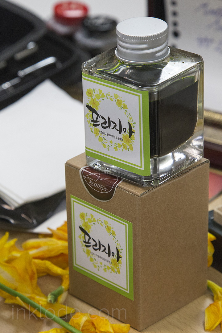
“Freesia” Penhood fountain pen ink sale (first come first serve)
11:00 – 12:40
Pen Show Lectures
(11:00) Notes on vintage pens
(11:30) Methods for proper writing
(12:00) Domestic (Korean) fountain pens
(12:30) Pencil hand-sharpening techniques
1:00 – 3:00
Auction
3:00
Final sales of “Freesia” Penhood fountain pen ink (first come first serve)
3:30 – 5:10
Pen Show Lectures
(3:30) How to use eBay
(4:00) One point handwriting fix
(4:30) “Is this normal?”
(5:00) Q&A
5:15
Pen Show Bingo!
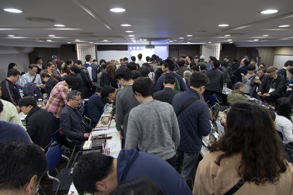
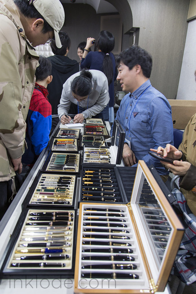
Unfortunately, I was unable to attend all of the events throughout the day, but I was able to arrive for many of the programs after lunch. This year, the room the pen show was held in was a bit larger to accommodate new tables including a paper-making station and a calligraphy station. When I arrived, it seemed like there were fewer patrons than previous years I attended, but it may be the timing of my arrival as people were finishing their lunch break. There were fewer pens on display, but I saw a lot of familiar faces and everyone seemed to be having a good time. The fact that the venue was quite a bit further out than the previous years may have also contributed to the final attendance numbers.
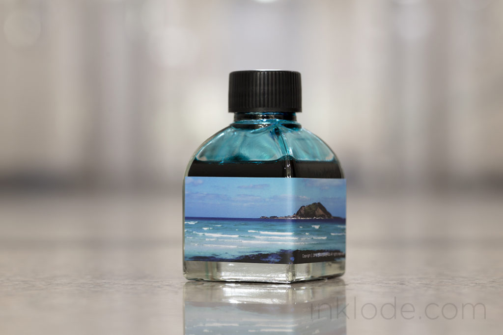
Penhood “Freesia” fountain pen ink
That being said, the lectures seemed to draw a lot of interest and there were a lot of young faces in the crowd. The paper-making booth seemed to be drawing a lot of attention as well. I arrived just in time to acquire one of the final bottles of this year’s Penhood fountain pen ink, “Freesia.” It’s a sort of greenish, yellow color and I look forward to making a full review of it. Patrons even received a handful of freesia flowers in keeping with the theme.
There is a lot going on in my life at the moment, but I am happy that I was able to make it out to the Seoul Pen Show 2017. I’ll be coming back to making pen and ink reviews in the near future, so stay tuned!
I almost missed the pen show this year. Thankfully, I received an email from a reader who was inquiring about the details of this years show which prompted me to discover that it would be much held much earlier than last year.
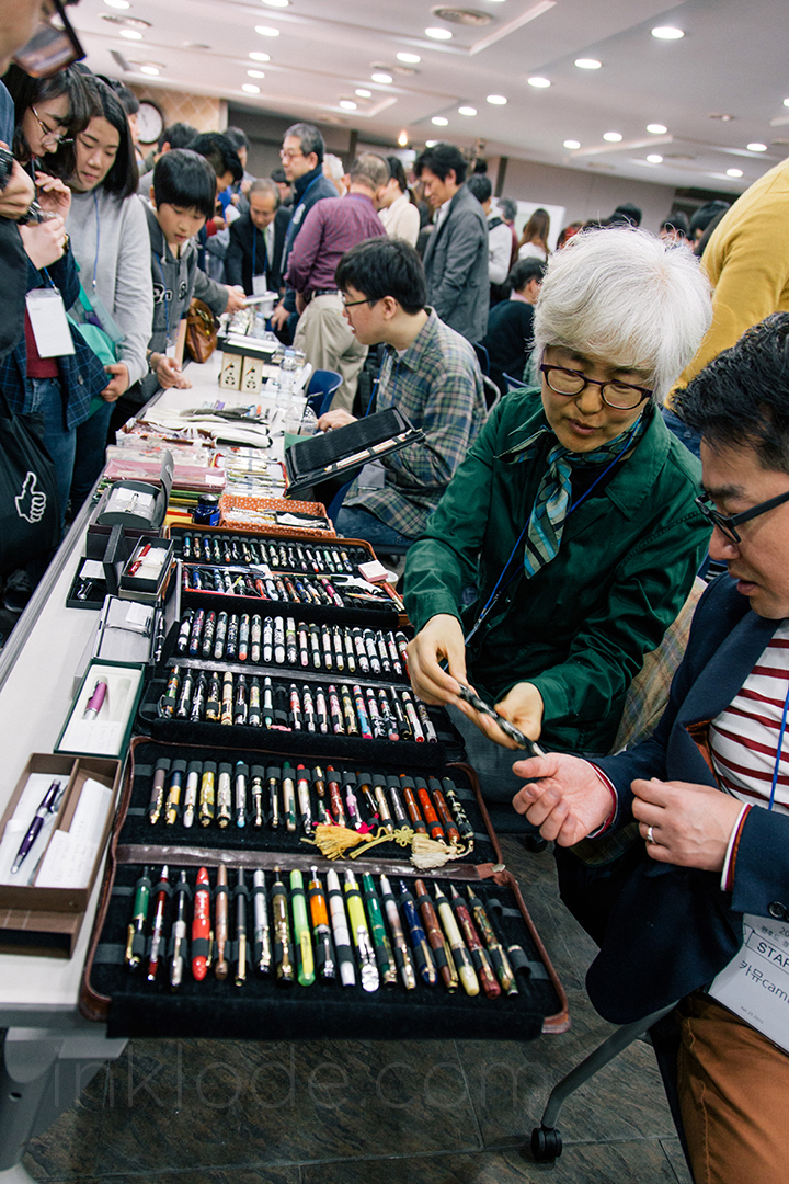
This is, of course, the Seoul Pen Show organized and hosted by the Korean pen community known as Penhood. So, on a beautiful and bright Saturday (April 9th), I headed on over to the Dongguk University area to attend. Unlike last year, there was no massive line outside. Perhaps it is because I went around lunchtime, but I’m just glad I didn’t have to wait too long to get inside. The show was held in the same room as the previous two years, but it seemed a little less packed than in 2015. That being said, there was still plenty to see.
As you can see, there was tons of fountain pen inks, rare pens, and enthusiasts with their collections adoring the various booths. It’s always great to see other fountain pen and ink aficionados sharing the love.
When you enter the pen show, you are assigned a number (as long as you registered on their website before attending [Addendum: It may have been possible to get a raffle number by showing up without registering as well.]) that will be used for a raffle during the course of the day. Through a series of fortunate events, I managed to be in the show room during the final call of the raffle. They were giving out just 50 bottles of a special 2016 Penhood Pen Show Ink made specially for this event. Out of almost 300 attendants, I figured the best chance I had to try out the ink would be to see if someone would be willing to decant a sample for me.
Finally, the announcer called out to say the final round of winning numbers and, believe it or not, my number was called. I couldn’t believe it. So here it is, ladies and gentlemen, the 2016 Penhood Pen Show Ink bottle.
Of course, a full review will be available soon, so keep an eye out! It is a lovely shade of blue.
Well, that will do it for this year’s spring pen show. Hopefully I will find some time to get back to writing reviews. Thanks for stopping by!
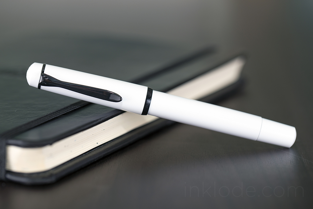
Earlier this year, I was tipped off about someone selling a small quantity of old Pelikan M100 White fountain pens for a really great price and I knew that it was an opportunity too good to pass up. It arrived safely and quickly and I was happy to see that it included all of the original packaging. This pen, which has been affectionately dubbed the Pelikan “Stormtrooper” due to it’s color scheme resemblance to the Imperial soldiers from the Star Wars universe, has become a bit of a “common collectors item” as of late. It entered production in March of 1987 and was officially discontinued in November of 1993 (due to low demand, unfortunately), so it can only be acquired second-hand. (A black version remained in production until 1999.) Still, it remains a beautiful pen and is (usually) priced at a very affordable range.
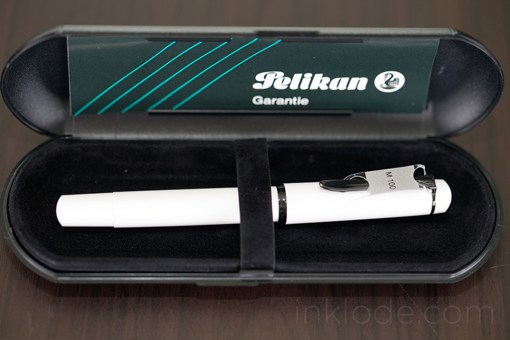
Packaging
The outer sleeve box shows some slight signs of wear, but is otherwise still in great shape. The original stickers still bear the model numbers and identifying information clearly and boldly. Once the outer sleeve is removed, the remaining plastic clamshell is a simple but effective piece of protection for the pen itself. Opening it up reveals some relatively rough felt lining, a simple felt strap to hold the pen in place, and the original documentation. While the felt strap is nice, the actual work of holding the pen in place is a small elastic loop located right beneath it.
Appearance and Design
The body of the pen is a very stark, bright glossy white with black accents around the cap and on the always recognizable Pelikan clip. Removing the cap with an easy 3/4 of a full-twist reveals the dark black, steel nib with an older “two-chick” Pelikan logo. The feed fins and tipping look great, as can be expected of a Pelikan pen. The cap threads are slightly raised above the grip section, but I did not experience and discomfort from them. The section tapers off heading towards the nib, but ends in a very subtle flare which is particularly beneficial on a smaller pen like this. Flipping the pen around reveals the piston knob with its wonderfully smooth action. The piston glides like knife through hot wax and is one of the best qualities of this low-cost instrument.
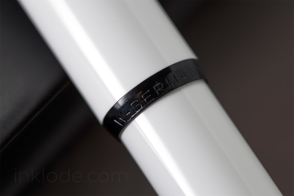
One of my favorite features of this pen, however, is of course the “W.-GERMANY” emblazoned across the pen cap’s accents. While there are a plethora of Pelikan pens floating around with these words marking their point of manufacture, it never ceases to be a point of intrigue for me–to hold this small piece of historical memorabilia so blatantly trumpeting its place in the timeline of the world. These markings are repeated on the bottom of the clamshell case as well.
Writing Experience
Being labeled an M100, it is easy to assume that this pen is rather small–and you would be right. This pen is not going to be winning any size contests, but it is not dainty. It feels well put together, but it does not seem like a pen that can take too much of a beating. Not that I would run this pen through a rock tumbler, but it is certainly one I will be saving for my desk at home as I have no plans to throw it in my bag and haul it around the world. Despite its small size, it is surprisingly comfortable to hold. Yes, I still prefer larger pens, and no, I probably won’t be using this pen for long writing sessions. But this pen is well balanced enough to be a joy to write with in any normal circumstances. Posting the pen adds a bit of comfortable length to it and does not throw off the balance. The nib is smooth, but provides a decent amount of feedback as well. Someone seeking an ultra-smooth nib best look elsewhere, but if you like to feel the paper you’re writing on a bit, this nib will get you there. No issues with flow or skipping, and honestly finding a pen that is under $100 with a piston that works this well is not an easy task.
Conclusion
The Pelikan M100 “Stormtrooper” White is a small piece of Pelikan history that can be found at relatively low-prices around the internet these days (though this may change into the future). Considering its small size and relatively lightweight body, it may not be suited for everyone, but it is still a great little pen to have and I am delighted to have it in my collection.
Special thank you to Nancy and Christiane at Pelikan US and Pelikan Germany Customer Service respectively for their help in getting me a few more historical details on this pen.
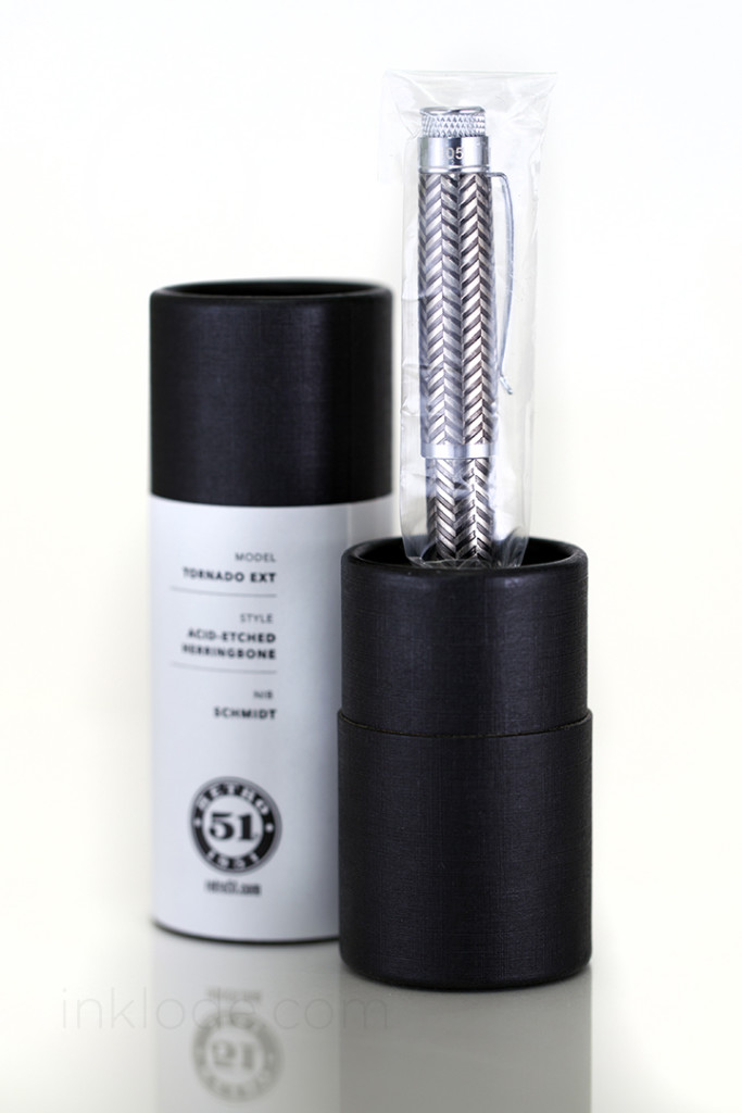
In early 2015, US-based fountain pen company Retro 51 partnered with the community-driven e-commerce website Massdrop to produce a limited edition fountain pen specifically for the Massdrop community. After an initial round of voting where community members cast over 1,300 votes, the final design was chosen and production of the pen commenced. After some unfortunate delays in production, the completed pens were successfully shipped out to the lucky few who placed an order for this beautiful pen.
Packaging
The pen comes in a simple, friction-fit cardboard tube that has a very nice and sturdy feel to it. A white label is wrapped around the center of the tube with the Massdrop logo as well as a brief history of the pen and the details of how it came to be. On top of the tube, there is a sticker with more information about the model of the pen and so on. The base of the tube has another sticker which indicates the limited edition number of the pen. Looking inside the tube, one will find a foam base that holds the pen upright, foam in the top of the lid to protect the top of the pen in case it shifts around, and a “manual” with the standard international converter folded inside. Overall, the packaging is simple and an elegant solution where more traditional packaging might feel a bit too heavy handed for a pen of this style. Concealed within the pen itself are two mini cartridges containing black ink so you can start writing right away.
Appearance and Design
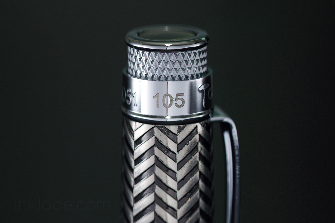
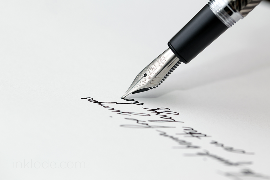
Like many others, I was skeptical when the voting results came in showing that the community had chosen the “Acid-Etched Herringbone” pattern as the final design. However, my worries were allayed when the first images of the prototype pen surfaced in the Massdrop discussion thread. The acid-etched pattern feels great in the hand and it looks absolutely stunning in person. The cap maintains many of the common design elements from Retro 51 pens like the knurled crown and the unique shape of the clip. Since this was a limited edition run, the edition number has been etched into the pen cap sandwiched between “RETRO51” and “Tornado.” Constructed of a lightweight metal, the pen walks the thin line between feeling very sturdy and feeling really lightweight. I have no concerns about this pen getting banged up as the feel in the hand is very solid. Though the screw-cap threads on the pen body are made of metal, the threads within the cap itself appear to be made of a white plastic. Time will tell if these threads will hold up to long-term use. That being said, the threads hold the cap perfectly well with one and a half turns to securely fasten the pen. Although the cap posts somewhat deeply, it does not feel very secure at all and I would not recommend posting the pen as it feels like the cap could slip off. The grip section of the pen is a black plastic that feels a bit cheap compared to the rest of the pen, but it is comfortable to hold and the step-down between the section and the threads is slight enough to not be too bothersome for most. The nib itself is adorned with a simple scroll pattern, logo, and the words “Schmidt Iridium Point.”
Writing Experience
Although some have reported that their nibs (by Schmidt) were a bit scratchy upon arrival, my copy laid down a perfectly smooth line without any fuss. The nib gives a tiny bit of feedback, but it is not scratchy at all and is actually quite pleasant to write with. Flow is good and despite the fact that the pen lays down a thick wet line, the feed has no trouble keeping up with fast writing. To my surprise, the nib even expressed a bit of flex with the right amount of pressure and has a nice bit of bounce to it. However, I would not recommend flexing it on a regular basis. Initially, I was concerned that the pen having a metal body and plastic grip section would cause it to feel back heavy, but the longer I wrote with it the less I seemed to notice any weight discrepancies. Attempting to precariously post the pen definitely tipped the scales into the “back heavy” territory. The cartridges worked perfectly well out of the box (tube) and the piston-fill cartridge gave me no issues at all.
Conclusion
The Retro 1951 Tornado EXT M1 is a beautiful and unique pen that I am proud to have been a part of from watching the community vote online to finally holding it in my hand. While the pen itself doesn’t bring anything particularly unique to the table as far as writing experience, the design and story behind its inception is more unique than most. That being said, it is a solid performer, an excellent pen to carry around and would be sure to pique the interest of any fountain pen enthusiast who might catch a glimpse of it out in the wild. If you can somehow get your hands on one, I say go for it.
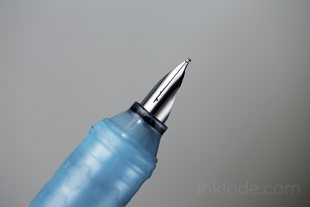
Anyone who is familiar with Korean stationery supplies will be probably know the name Morning Glory. Having been one of the nation’s top stationery supply manufacturers since its inception in 1987, when it first entered the market, Morning Glory has expanded its operations to over 20 different countries. Though they are best known for manufacturing notebooks and office supplies with cute cartoon characters on them, they have also seen fit to produce an affordable (in the $2 USD range), entry-level fountain pen for the budding enthusiast—the Morning Glory CalliCally.
Appearance and Design
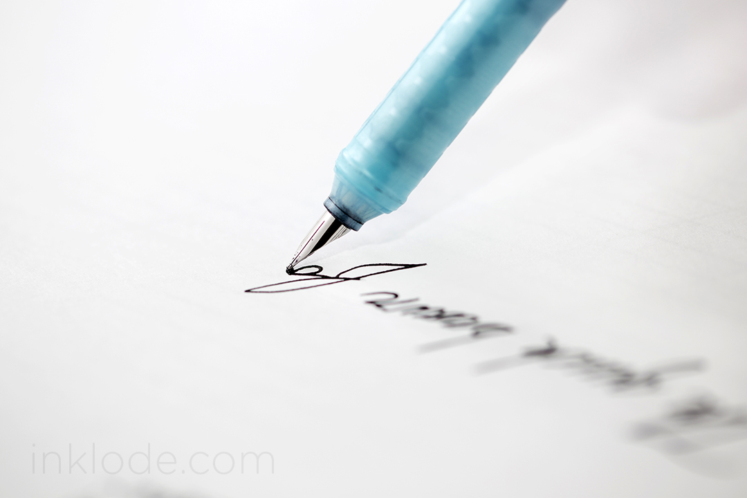
There is no doubt that this is a cheap pen. The soft blue-green color scheme and obvious branding stamped onto the side of the pen ensure that it fits in perfectly on a shelf between the ballpoint pens and the Platinum Preppy fountain pens. Though the plastic material of the barrel feels light, it does not seem too weak to withstand daily wear and tear. On the other hand, the grip section feels like plastic borrowed from a toy with its funny little grip pattern imprinted into it. Despite all of this, holding the pen isn’t too uncomfortable. There is a significant step down from the barrel to the grip which some might find troublesome. The cap posts deeply and securely so there is no concern of it falling off while writing, and it clicks on to the front end with an equal amount of security. The nib is tiny and features no decorations or branding of any kind (not that there is much space for any of that). Overall, the size of the pen is adequate, but the heft of the pen leaves me wanting. The cap contains enough plastic to actually make the pen somewhat back-heavy when posted. Not enough to cause any issues, of course. The pen is accompanied by six mini-cartridges filled with Morning Glory’s proprietary black ink.
Writing Experience
Initially, the nib would not lay down a consistent line and the feed could not channel ink properly. After tweaking the nib a bit, the pen finally started to write. The nib is surprisingly smooth and I could see how the pen might be a great beginning tool for a young student. My only concern would be the slightly fragile nature of the construction versus something more solidly built like a Platinum Preppy. There is no flex in the nib. If you even attempt to flex the nib, it will become bent beyond recognition and will cease to function. Following the initial adjustments, the feed kept up perfectly and there was no skipping of any kind. It provided a perfectly acceptable writing experience that actually became rather pleasant after a while. The only issue I had was that the lightweight nature of the pen did not suit me for longer writing sessions. As a side note, the ink in the cartridges that come with the pen is surprisingly water resistant and a very deep shade of black. I might have to acquire more and do some tests with it.
Conclusion
This is a cheap pen, and you get what you pay for. And for (essentially) $2 USD, you get a pen that can write well, comes with several permanent black ink cartridges, and is a bit different from your average ultra entry-level fountain pen. Obviously it is nothing close to a must-have, but if you can get your hands on one, it could be a fun option for someone who appreciates the “quainter” side of life who you are introducing to the wide world of fountain pens.
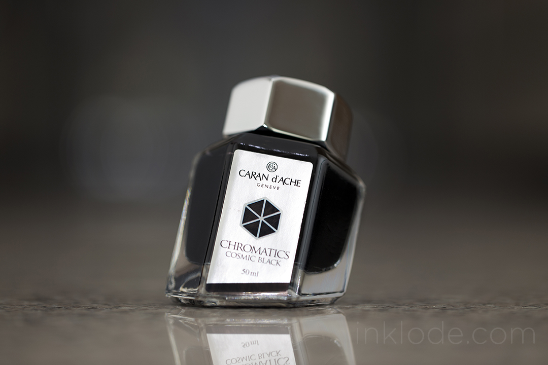
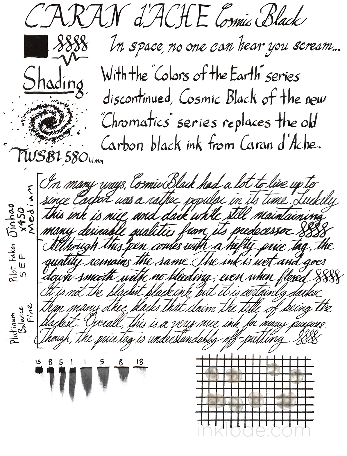
A lot of people were sad to see the retirement of Caran d’Ache Carbon Black ink when the Colors of the Earth series was discontinued. When the Chromatics series was announced as its successor, many were enthralled by the packaging but balked at the price tag. Though most have already drawn their own conclusion as to the legitimacy of the price point, I wanted to see how the new Cosmic Black stacked up.
As Cosmic Black was my first bottle of the new Chromatics inks, I spent a few moments to take in the interesting packaging. The glass bottle took on a peculiar shape with a slanted base which (supposedly) allows for easier filling when the ink level gets low. The base of the ink bottle box is constructed in a way that the bottle will sit “flat” while inside it (see photos). Even though the bottle is made of glass, the screw-cap is actually made of a highly polished metal. I found it quite appealing except for the fact that the metal threads inside the cap seemed to have broken off small shards of the glass threads on the bottle at some point down the line before reaching me. However, this did not affect the lids effectiveness in preventing ink from spilling everywhere, so I set it aside and moved on.
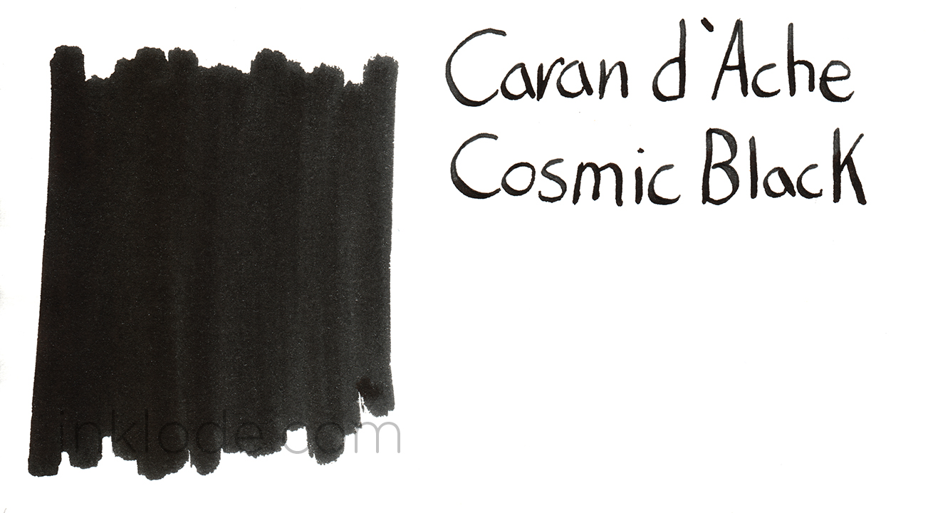
So, is Cosmic Black as dark as the center of a black hole floating in the vacuum of space at the heart of a barred spiral galaxy? Well, not quite—but it is certainly a respectably dark black.
The ink is quite a wet writer and lays down a nice, dark black line. While it is not the blackest black I have ever seen, it tends to lean towards a nice deep black while occasionally straying to a dark gray. The dry times are moderate to long, but it was never enough to cause any problems. There is a very tiny amount of shading if you are in a bright light and hold it at just the right angle, but for the most part it is a fairly straight forward black. When the ink is allowed to pool up a bit, there is a small amount of sheen that can be seen. It is not significant, but does present the ink with a noticeable gloss in the right light. Water resistance is moderate to poor. After exposure to water, the ink smears quite a bit but still remains legible. I found no issues with skipping or flow, and I was very happy to see that the ink was incredibly easy to clean out of my pens (even after a few days of sitting around).
Overall, I would say that this is a very nice black ink and I am more than happy to have it as a part of my collection. However, the price tag is quite high and I do not find any special qualities that justify the extra cost. There are certainly other black inks out there that would fill the needs of most users just as sufficiently but at a much more affordable price. That being said, if you enjoy the fancy packaging and have plenty of money budgeted for your inks, Caran d’Ache Cosmic Black could be a fun purchase.
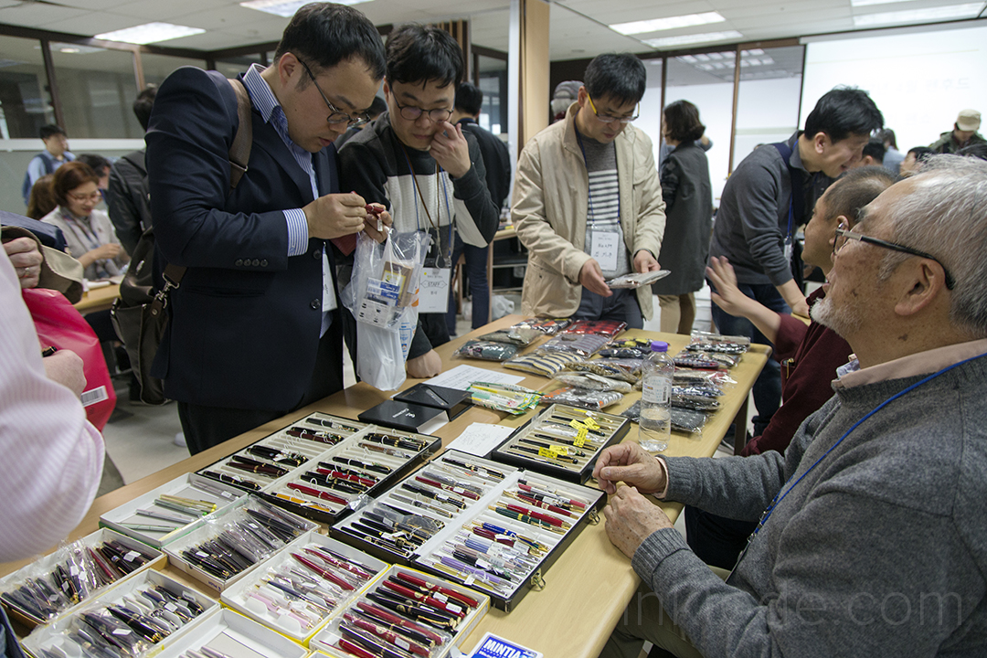
It’s that time of year again~ Spring is in the air and pen shows are popping up all around the world. Of course, Seoul is no exception and the Penhood community in Seoul organized their annual Spring pen show on Saturday, April 25th. The weather was unseasonably warm having been quite cold just a week before. While the warm weather was certainly a welcome change, it did make waiting in line outside in the hot sun less of an appealing aspect. Luckily, the wait wasn’t incredibly long, and soon I was amidst the pulsing throngs of patrons seeking to satiate their lust for beautiful writing utensils.
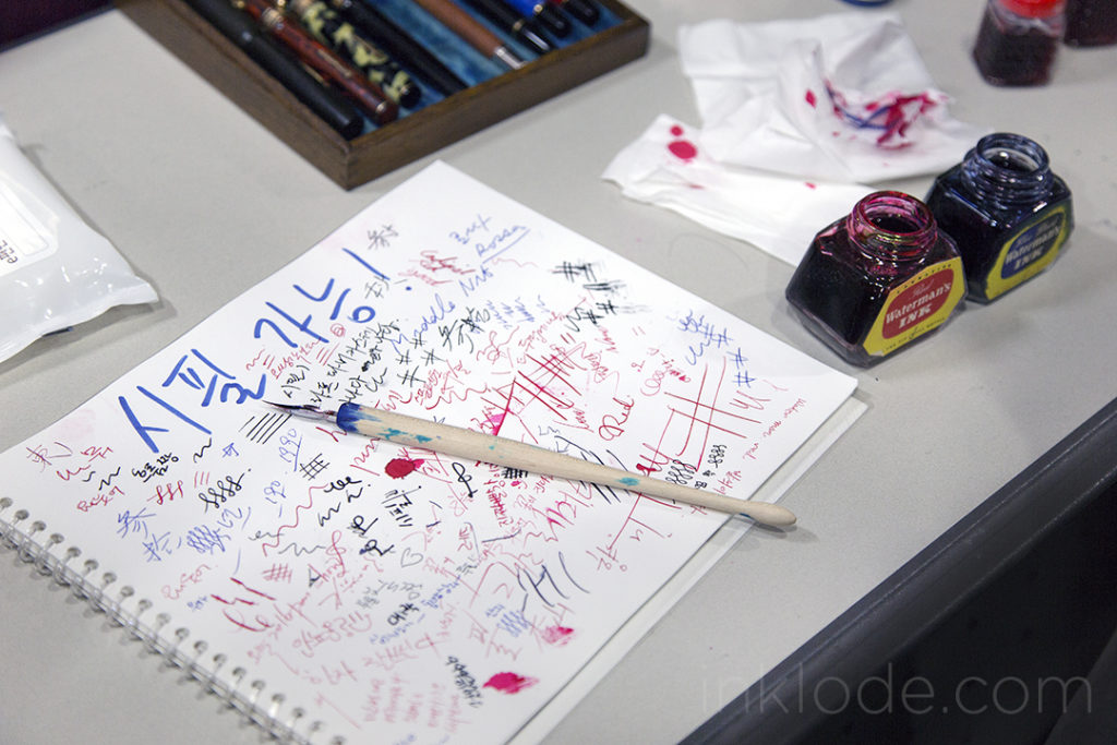
Though the space was confined to the usual mid-sized conference room, there was plenty to see and plenty to do for the waves of people swimming through the cramped aisles. Fountain pens of all sizes and ages, many different bottles of inks, and plenty of Penhood exclusives that have been put on sale by the community over the years (not to mention the occasional rare Korean fountain pen). It was another successful show, and my only regret is that I could not stay longer to make a few purchases. I’ll let the photos do the rest of the talking.
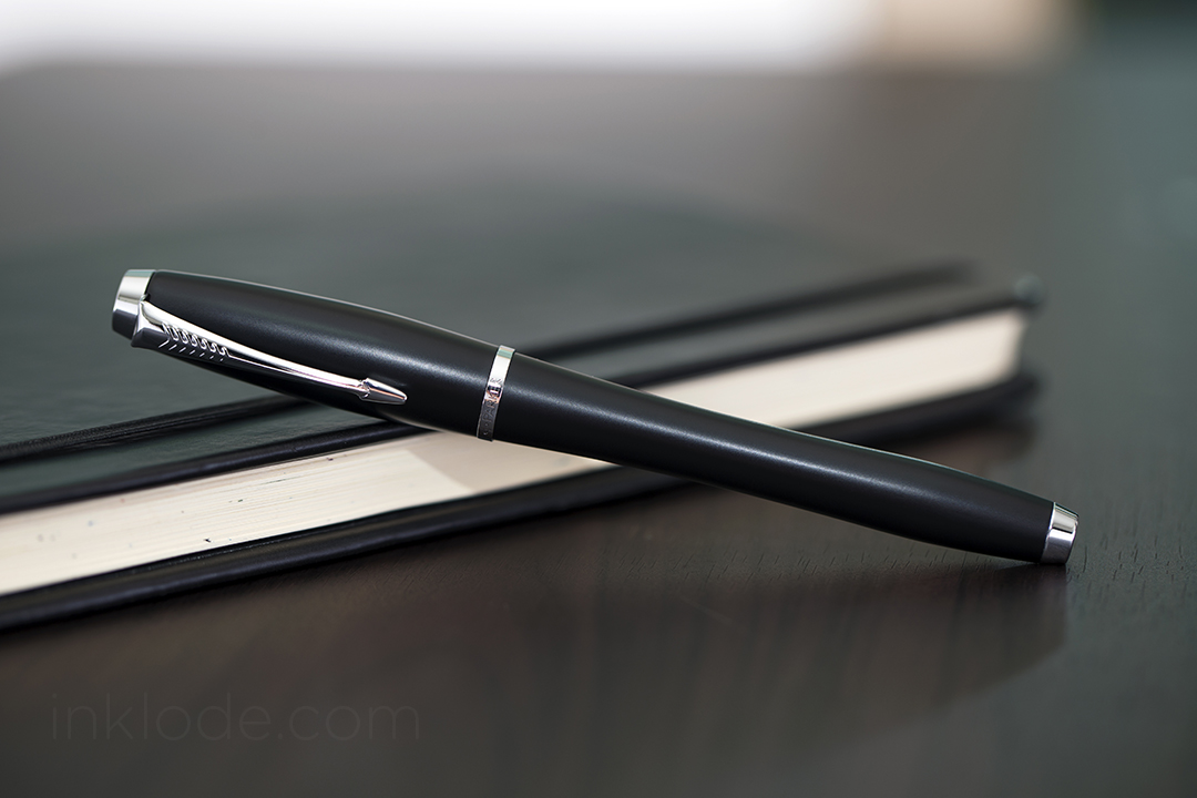
Throughout fountain pen history, the Parker pen brand has been associated with some amazingly beautiful fine writing instruments. Today, Parker pens have found a much more humble following of fans and enthusiasts. Part of the reason for this shift may be due to the fact that Parker have downplayed their role in making entry-level fountain pens and have been focusing on their higher-end luxury lines. However, that isn’t to say that they have completely abandoned the more affordable price ranges. The Parker Urban is a perfect example of a fountain pen that is both sleek and reliable.
Appearance and Design
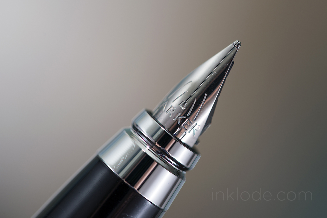
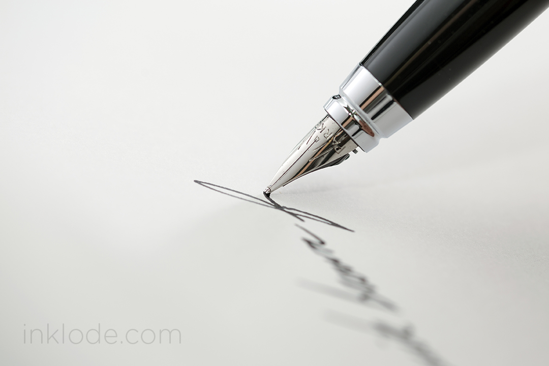
The Parker Urban features a sleek, elongated pear-shape where the undulated contour of the barrel and cap make the pen seem like the body was given a slight squeeze towards the back. I find this design to be very appealing and the pen feels really nice to hold. Gripping the pen is easy and, while some may find the step down from the grip to the barrel to be too steep, the grip does not feel slippery or uncomfortable to write with. While Parker saw fit to make the pen in a variety of colors, I still found myself drawn to the matte black with silver trim. The snap-on cap features Parker’s iconic arrow clip and the bottom cap band is engraved with the word “Parker” accompanied by their logo. The back of the pen is balanced out with silver trim to balance out the trim on the cap. Most of the pen is constructed of steel which gives the pen a good amount of heft. The pen itself is well constructed and I found no flaws or blemishes from the manufacturing process. The nib is incredibly small and seems like it was given the appearance of a hooded nib without actually being one. The feed is simple in appearance and is equally small to match the nib. Nib decoration is a few simple markings with the word Parker engraved across it. Posting is easy and the cap feels somewhat secure, but a good jostling could certainly convince the cap to go flying off into the ether. The pen is accompanied by a plunger-style converter and also accepts cartridges.
Writing Experience
Despite the nature of the construction material, the Parker Urban does not feel too hefty to write with. While posting the pen does make it feel a bit too back-heavy, it is not nearly as uncomfortable as posting some other all-metal pens I have used previously. The nib, though small, puts down a very smooth and wet line. While you may be able to coax a tiny bit of flex out of it, the nib is certainly not designed for it and I do not recommend flexing it. That being said, the pen can be comfortable to write with for extended writing sessions and will put down a consistent amount of ink. The feed seems to have no trouble keeping up and I have never had any experiences where the pen skipped or ran dry.
Conclusion
The Parker Urban may not be as fancy as a Parker Vacumatic of old, but it is a smooth writing pen that comes in a sleek and stylish design. Although the price may seem a bit high, I still think I can give this pen my recommendation. It is a fun, yet classy, looking pen that could certainly become a sturdy every-day-carry. So if you already have a few pens in your arsenal and are looking to try out an affordable, modern Parker pen, the Urban is worth a look.
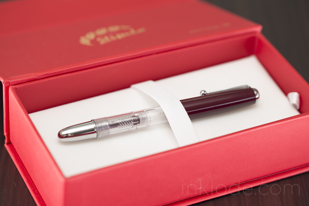
The Stipula Splash hit the market in late 2014 with the marketing materials focused on the fact that it was a piston-filled demonstrator pen with a mini “V-flex” nib with an MSRP of $79 USD from the Italian pen manufacturer.
Packaging
The box it arrived in was a sturdy, red-colored cardboard box with a magnetic flap to keep it closed. Inside was a faux-velvet pad with a strap to secure the pen in place. The space beneath the pad housed the manual which detailed how to care for and fill the pen in both English and Italian. The packaging was nothing particularly special, but it was perfectly adequate for keeping the pen safe on its journey. Though, I do feel the box may have been a tad larger than necessary and the strap securing the pen does not do the best job at preventing it from sliding around.
Appearance and Design
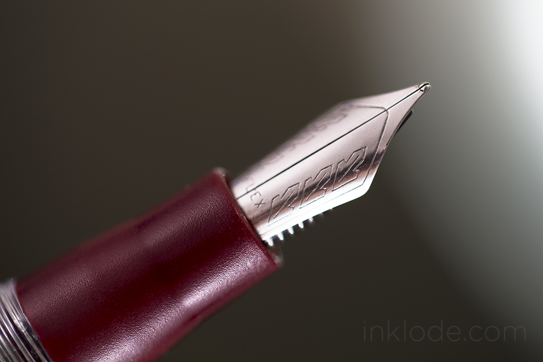
The pen is lighter than I had anticipated. The plastic material out of which it is constructed feels very light-weight and potentially fragile. While the body might be able to take some hits, the cap feels particularly vulnerable to cracking if mishandled. I ordered the Stipula Splash in the lovely Bordeaux color scheme. The cap and grip section are the only colored parts of the pen as the barrel is clear, the piston is transparent, and the piston knob is polished metal. Personally, I wish the piston knob was a matching shade of Bordeaux to balance out the appearance of the pen. The Stipula leaf logo sits in relief on the flattened top of the cap which gives way to a simple, but sturdy, clip. There is one single metal band wrapped around the cap near the base and looks to be made of a cheaper material than the rest of the metal on the pen. Once posted, I find the pen looks much more appealing with the beautifully clear barrel sandwiched between the colors of the cap and grip section. Although the piston knob is solid metal, the relatively short length of the pen helps prevent it from feeling back heavy when it isn’t posted. However, posting the pen adds a comfortable length but also tips the scale towards making the pen uncomfortably back-heavy. The nib is very small and is split down the center to allow for flexing of the steel tines and is adorned with a simple repetition of the Stipula leaf logo that is subtle and elegant. One thing that could double as a pro or a con is the lack of long threads for the screw-on pen cap. It only takes 1/2 a turn of the cap to remove it. While this does raise some concerns about the pen uncapping itself if one were to carry it in a pocket, I can appreciate this design as it does make uncapping and re-capping the pen effortless and allows me to start writing quickly when I need to. Though I have heard complaints about leaking, I have not seen any such issues with my version of the pen. It can hold a good amount of ink, but due to the way it is constructed, I was unable to completely fill the reservoir with ink normally.
Writing Experience
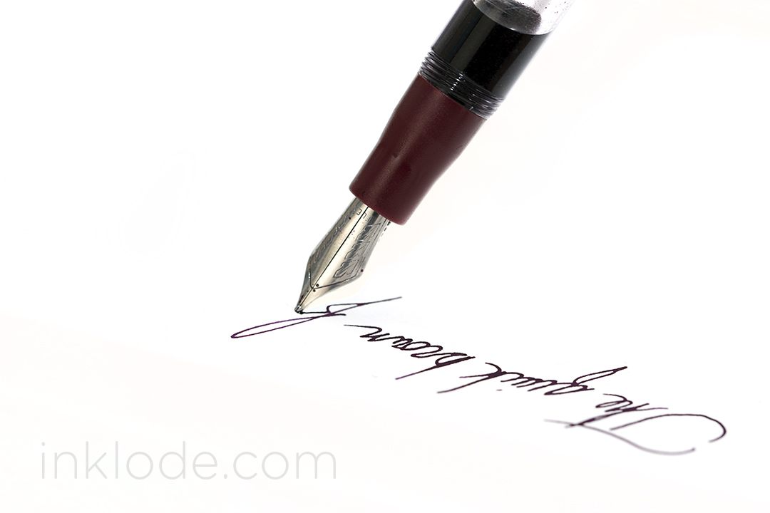
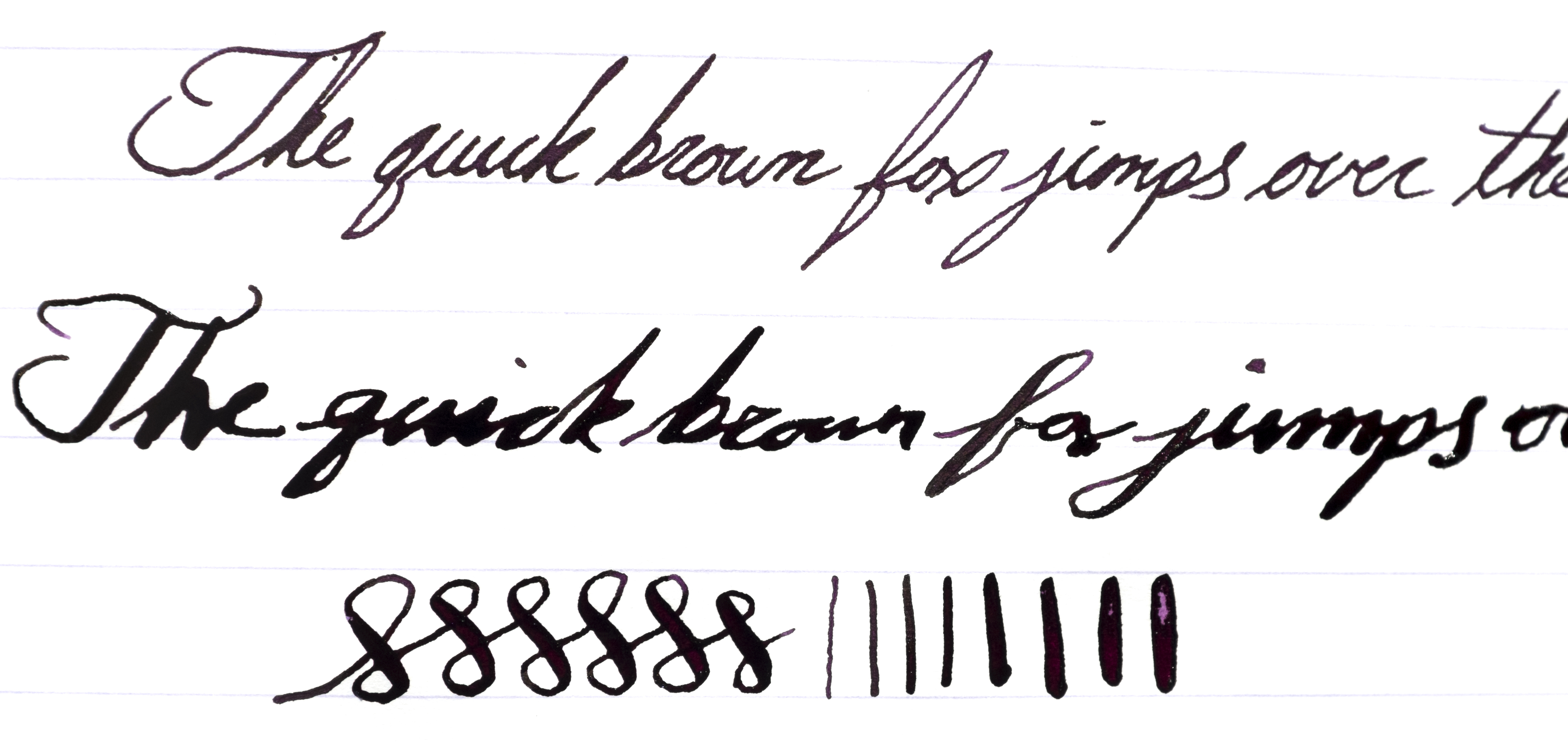
Although this pen has been touted as housing a mini-flex nib, the small size of the pen and nib means any significant flexing requires a lot of pressure when writing. This becomes somewhat of an issue due to the fact that the nib itself is rather scratchy. Attempting to flex the nib makes me feel like I am going to tear into the paper at times. That being said, the amount of flex possible seems to be similar to that of the Noodler’s Ahab steel flex (even though the Noodler’s flex nib is much larger). I ran into a lot of railroading while attempting to flex this nib even after some minor adjustments, but the feed and nib keep up wonderfully with normal writing. As the ink reservoir gets low, the pen starts dropping more ink while writing. This may become a nuisance if the ink you are writing with is already quite wet or if it has longer dry times. After spending some time with the pen, I found that I became used to the (incredibly) narrow sweet spot where the nib doesn’t feel so scratchy and I have had a rather pleasant experience writing with the pen normally (as in not flexing the nib). The grip section is tiny, so if you have larger hands or prefer larger pens, this is definitely not for you. The good news is, the threads do not get in the way or feel uncomfortable.
Please pardon the sloppy flex writing.
As you can see, the nib lays down a nice wet “fine” line with normal writing. As I attempt to flex the pen, I occasionally run into difficulties where the feed becomes rather inconsistent in how much ink it is laying out (sometimes too much, sometimes to little). That being said, the amount of flex possible is rather nice but it simply requires too much pressure for it to be a comfortable experience.
Conclusion
The Stipula Splash seems to accomplish a multitude of things with the mini-flex nib, the “demonstrator” style ink reservoir, the piston filling mechanism, and the small compact size. They manage to fit a lot into a small package, but for the price I would expect this pen to feel a little more solid in the hand. I think this is a case of “jack of all trades, master of none” where the Stipula Splash comes with lots features, but none of them really stand out as exceptional (and some of them are just plain disappointing). That being said, I honestly don’t think it is a terrible pen, but I do think that Stipula is asking for a lot of money for what you get.
Nib material: Steel (v-flex)
Cap: Screw
Filling mechanism: Piston
Overall Length: 126 mm
Special thanks to Pen Chalet for sending me this Stipula Splash! Although this pen was provided at no cost, this review contains my 100% honest and unfettered opinion.
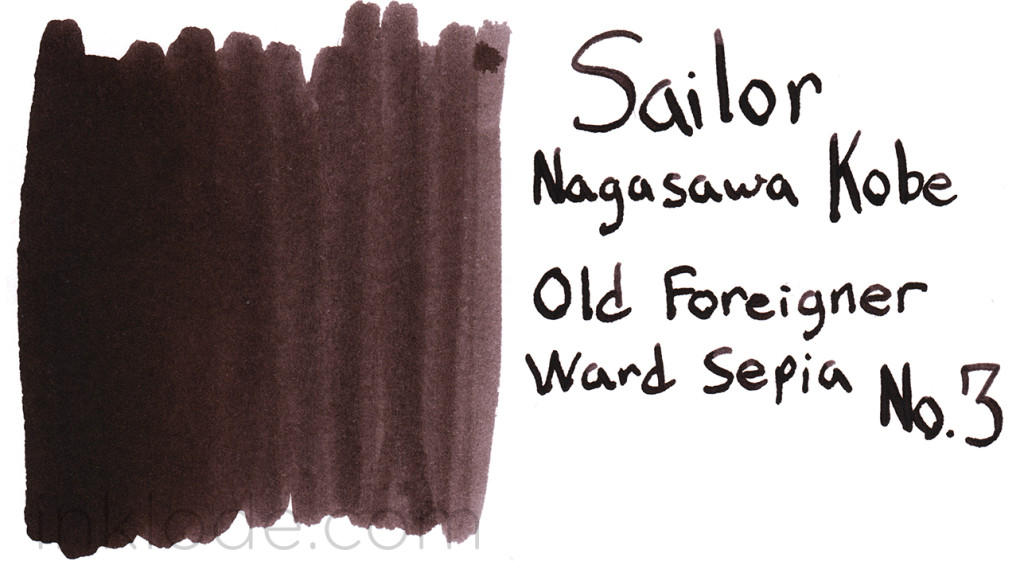
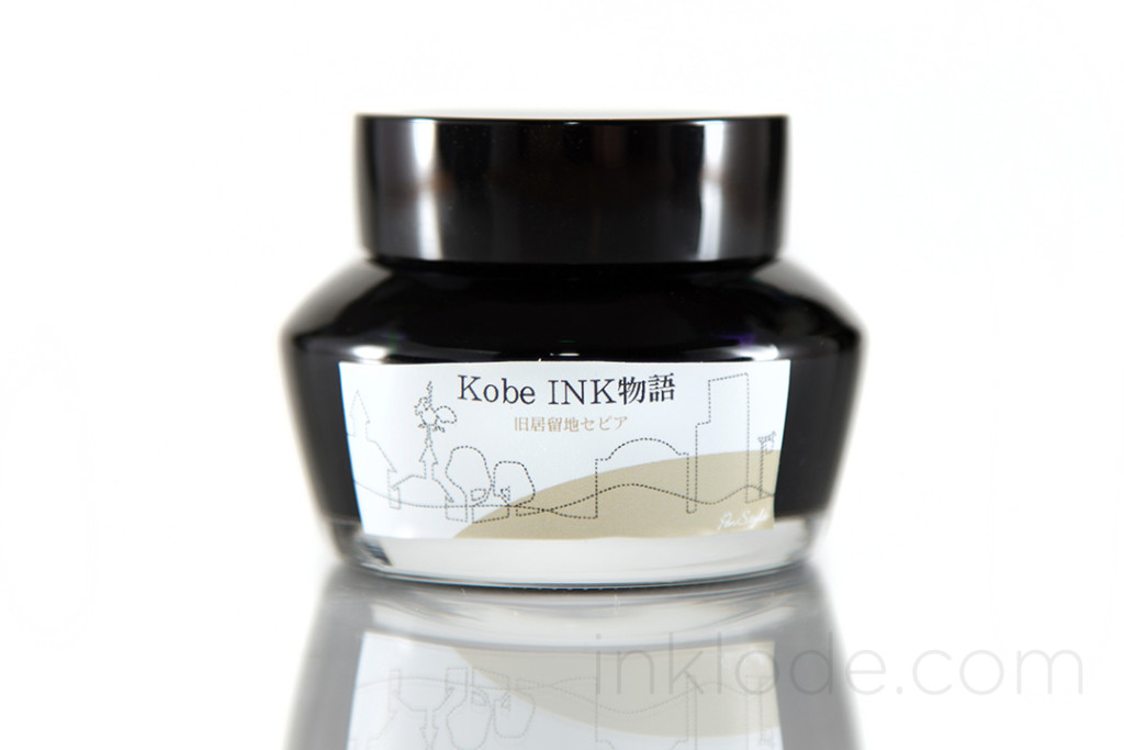
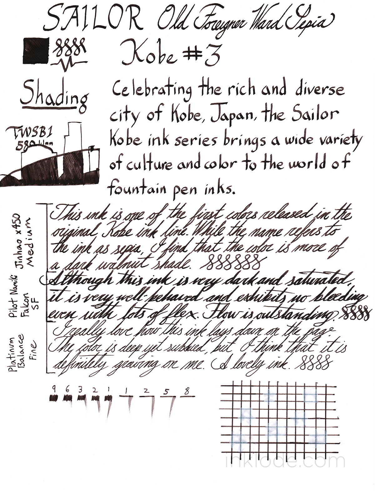
Sailor Kobe inks are exclusive to the Nagasawa shops and pay tribute to the many faces of Kobe, Japan. Old Foreigner Ward Sepia (旧居留地セピア) pays homage to the area of Kobe that is filled with a diverse variety of traditional buildings that take architecture cues from around the world.
Much like the Old Foreigner Ward itself, this ink is calm and evokes an “antiqued” feel. To be perfectly honest, the color was a lot darker than I thought it would be based on the existing photos online. This ink is a cooler brown color that can become almost black when it is used in a flex pen. The shading is very minimal and hardly noticeable in most practical applications. One element that I found pleasantly surprising is the fact that this ink flows wonderfully from every pen I tried it in. I had zero skipping or railroading and the ink was never too dry or too wet which helps to keep the dry times respectably fast. On top of that, when rinsed out with water, the ink cleared out of the pens very easily and left no visible residue. Exposure to water rinses away some of the color, but the ink remains legible in most cases so I would say the water resistance level is moderate.
Personally, while I do not think this is a color that would find its way into my pens on a regular basis, the properties and behavior of this ink make it a delight to use. If you are looking for a cool, dark brown ink, look no further.


 The body of the pen is a very stark, bright glossy white with black accents around the cap and on the always recognizable Pelikan clip. Removing the cap with an easy 3/4 of a full-twist reveals the dark black, steel nib with an older “two-chick” Pelikan logo. The feed fins and tipping look great, as can be expected of a Pelikan pen. The cap threads are slightly raised above the grip section, but I did not experience and discomfort from them. The section tapers off heading towards the nib, but ends in a very subtle flare which is particularly beneficial on a smaller pen like this. Flipping the pen around reveals the piston knob with its wonderfully smooth action. The piston glides like knife through hot wax and is one of the best qualities of this low-cost instrument.
 Being labeled an M100, it is easy to assume that this pen is rather small–and you would be right. This pen is not going to be winning any size contests, but it is not dainty. It feels well put together, but it does not seem like a pen that can take too much of a beating. Not that I would run this pen through a rock tumbler, but it is certainly one I will be saving for my desk at home as I have no plans to throw it in my bag and haul it around the world. Despite its small size, it is surprisingly comfortable to hold. Yes, I still prefer larger pens, and no, I probably won’t be using this pen for long writing sessions. But this pen is well balanced enough to be a joy to write with in any normal circumstances. Posting the pen adds a bit of comfortable length to it and does not throw off the balance. The nib is smooth, but provides a decent amount of feedback as well. Someone seeking an ultra-smooth nib best look elsewhere, but if you like to feel the paper you’re writing on a bit, this nib will get you there. No issues with flow or skipping, and honestly finding a pen that is under $100 with a piston that works this well is not an easy task.
 The pen comes in a simple, friction-fit cardboard tube that has a very nice and sturdy feel to it. A white label is wrapped around the center of the tube with the Massdrop logo as well as a brief history of the pen and the details of how it came to be. On top of the tube, there is a sticker with more information about the model of the pen and so on. The base of the tube has another sticker which indicates the limited edition number of the pen. Looking inside the tube, one will find a foam base that holds the pen upright, foam in the top of the lid to protect the top of the pen in case it shifts around, and a “manual” with the standard international converter folded inside. Overall, the packaging is simple and an elegant solution where more traditional packaging might feel a bit too heavy handed for a pen of this style. Concealed within the pen itself are two mini cartridges containing black ink so you can start writing right away.