Pelikan M100 “Stormtrooper” White
- By Adam
- In fountain pens
- With 4 Comments
- Tagged with fountain pen review Pelikan M100 Stormtrooper
- On 15 Dec | '2015

Earlier this year, I was tipped off about someone selling a small quantity of old Pelikan M100 White fountain pens for a really great price and I knew that it was an opportunity too good to pass up. It arrived safely and quickly and I was happy to see that it included all of the original packaging. This pen, which has been affectionately dubbed the Pelikan “Stormtrooper” due to it’s color scheme resemblance to the Imperial soldiers from the Star Wars universe, has become a bit of a “common collectors item” as of late. It entered production in March of 1987 and was officially discontinued in November of 1993 (due to low demand, unfortunately), so it can only be acquired second-hand. (A black version remained in production until 1999.) Still, it remains a beautiful pen and is (usually) priced at a very affordable range.
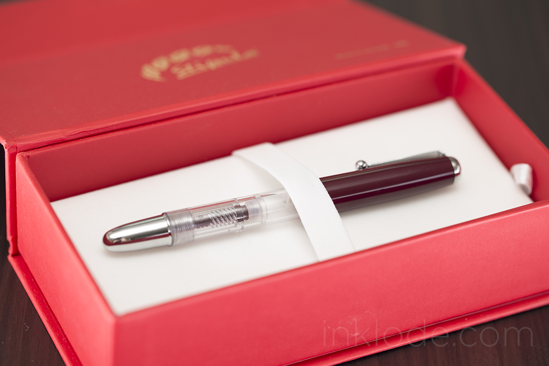
Packaging
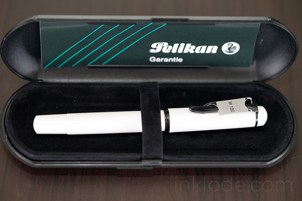
The outer sleeve box shows some slight signs of wear, but is otherwise still in great shape. The original stickers still bear the model numbers and identifying information clearly and boldly. Once the outer sleeve is removed, the remaining plastic clamshell is a simple but effective piece of protection for the pen itself. Opening it up reveals some relatively rough felt lining, a simple felt strap to hold the pen in place, and the original documentation. While the felt strap is nice, the actual work of holding the pen in place is a small elastic loop located right beneath it.
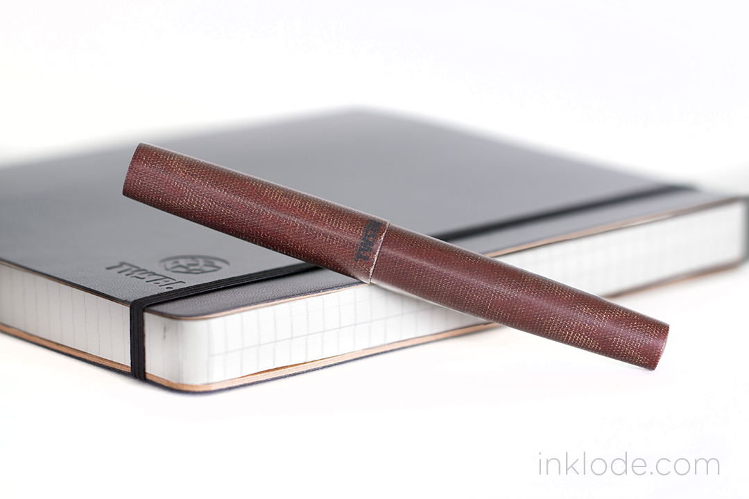
Appearance and Design
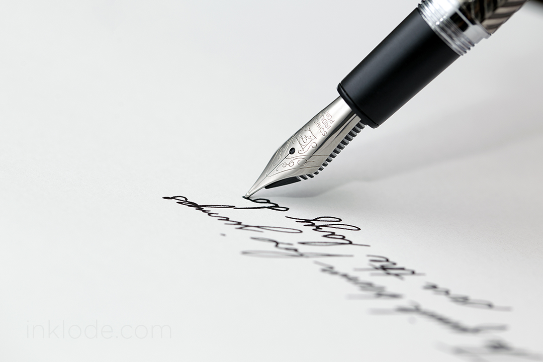
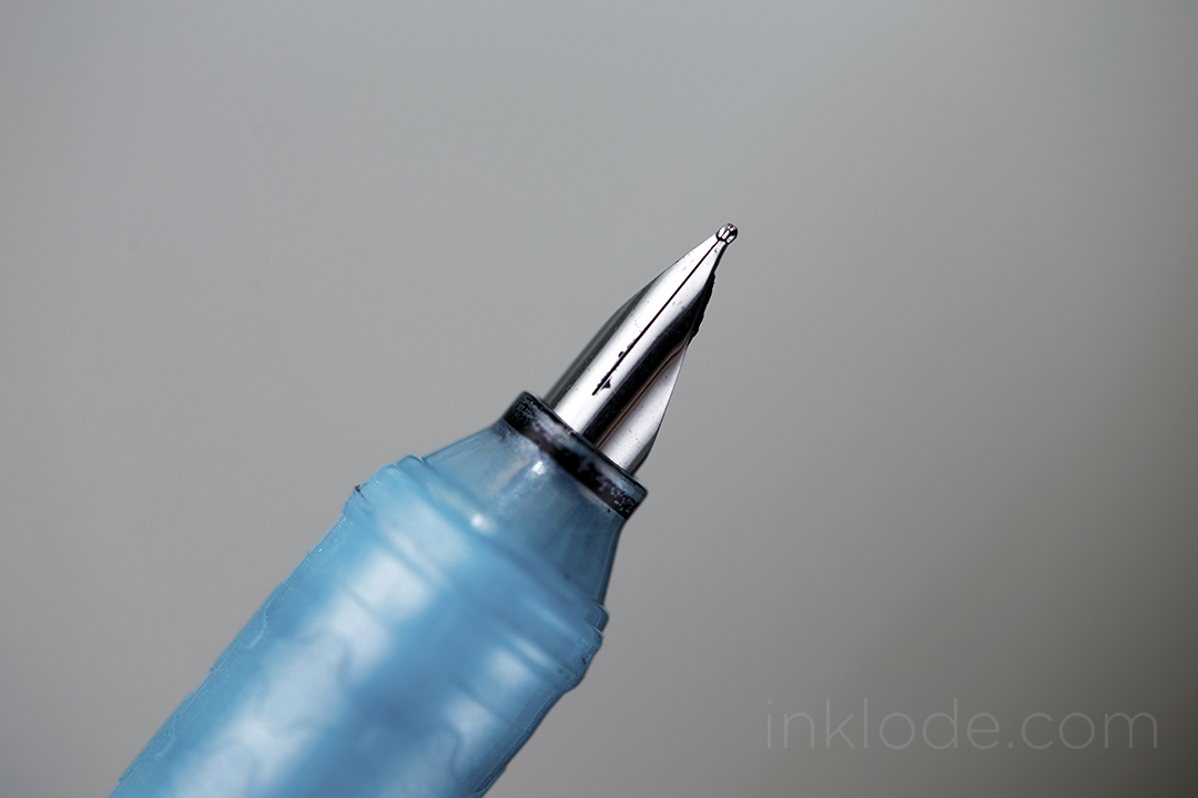
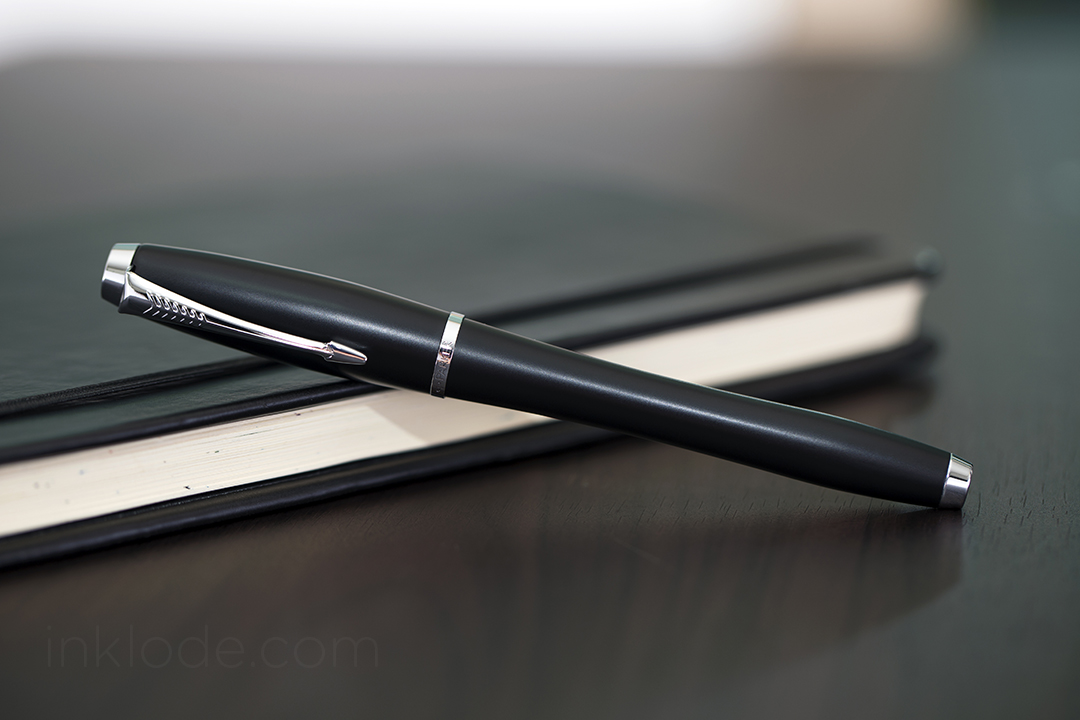
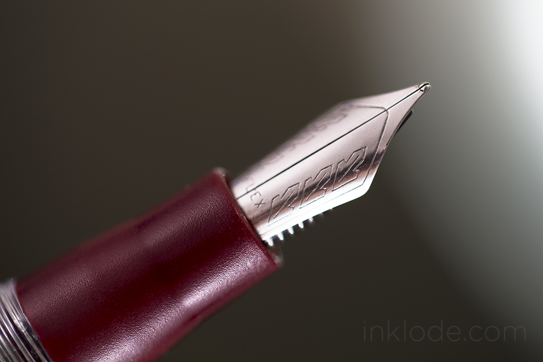
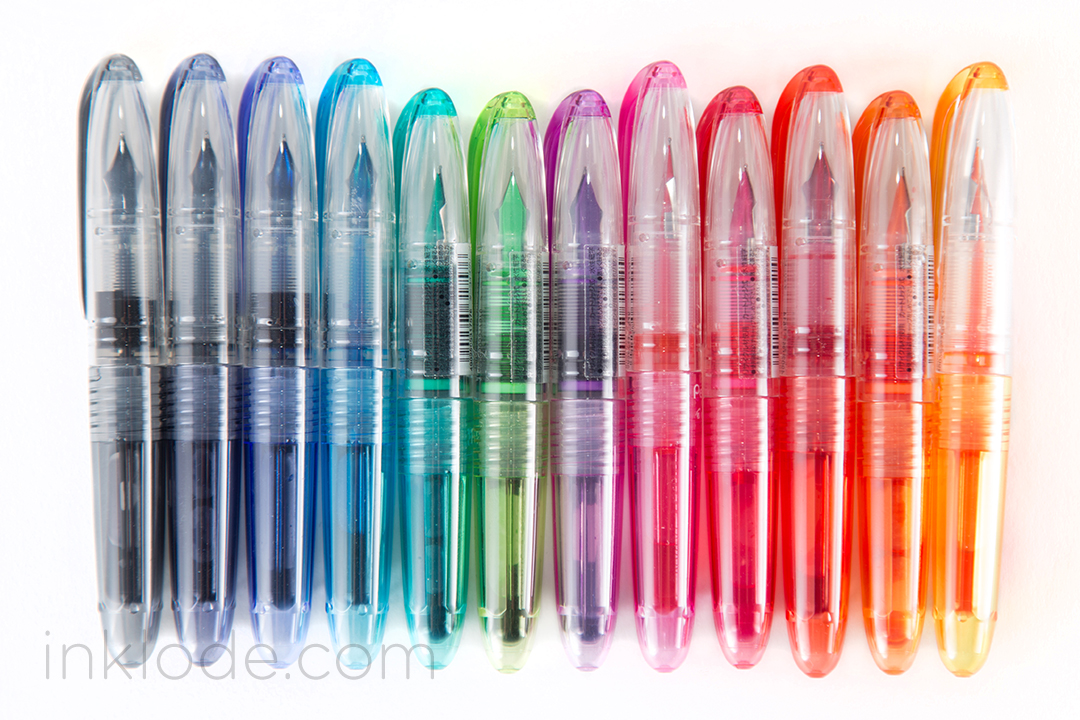
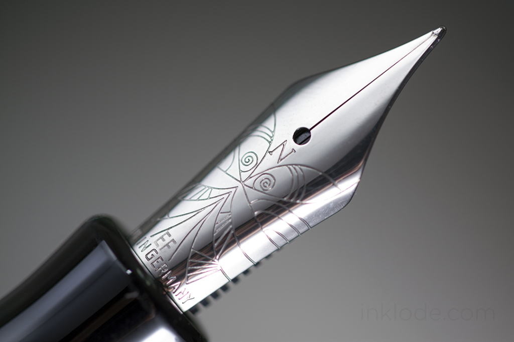
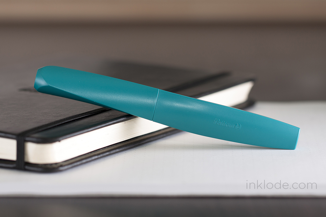
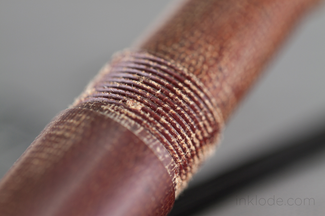
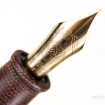
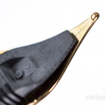
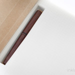
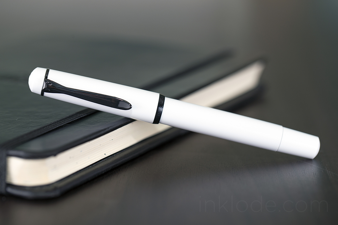
 The body of the pen is a very stark, bright glossy white with black accents around the cap and on the always recognizable Pelikan clip. Removing the cap with an easy 3/4 of a full-twist reveals the dark black, steel nib with an older “two-chick” Pelikan logo. The feed fins and tipping look great, as can be expected of a Pelikan pen. The cap threads are slightly raised above the grip section, but I did not experience and discomfort from them. The section tapers off heading towards the nib, but ends in a very subtle flare which is particularly beneficial on a smaller pen like this. Flipping the pen around reveals the piston knob with its wonderfully smooth action. The piston glides like knife through hot wax and is one of the best qualities of this low-cost instrument.
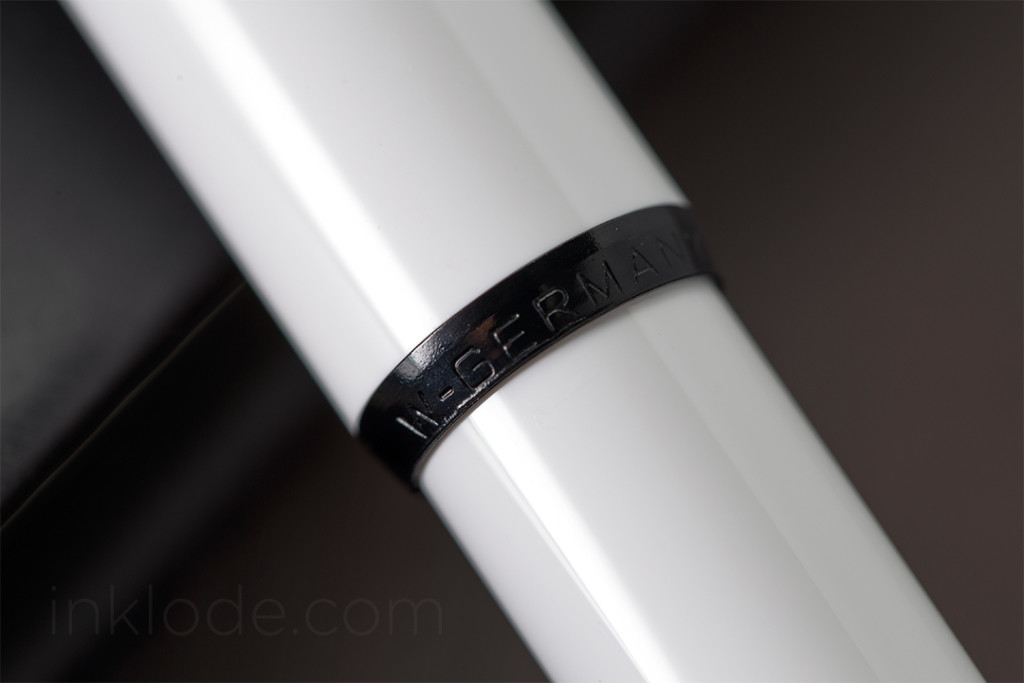
One of my favorite features of this pen, however, is of course the “W.-GERMANY” emblazoned across the pen cap’s accents. While there are a plethora of Pelikan pens floating around with these words marking their point of manufacture, it never ceases to be a point of intrigue for me–to hold this small piece of historical memorabilia so blatantly trumpeting its place in the timeline of the world. These markings are repeated on the bottom of the clamshell case as well.
Writing Experience
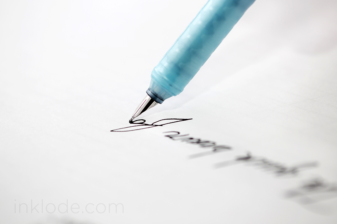
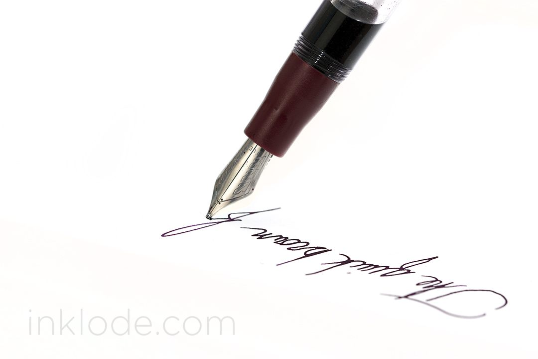
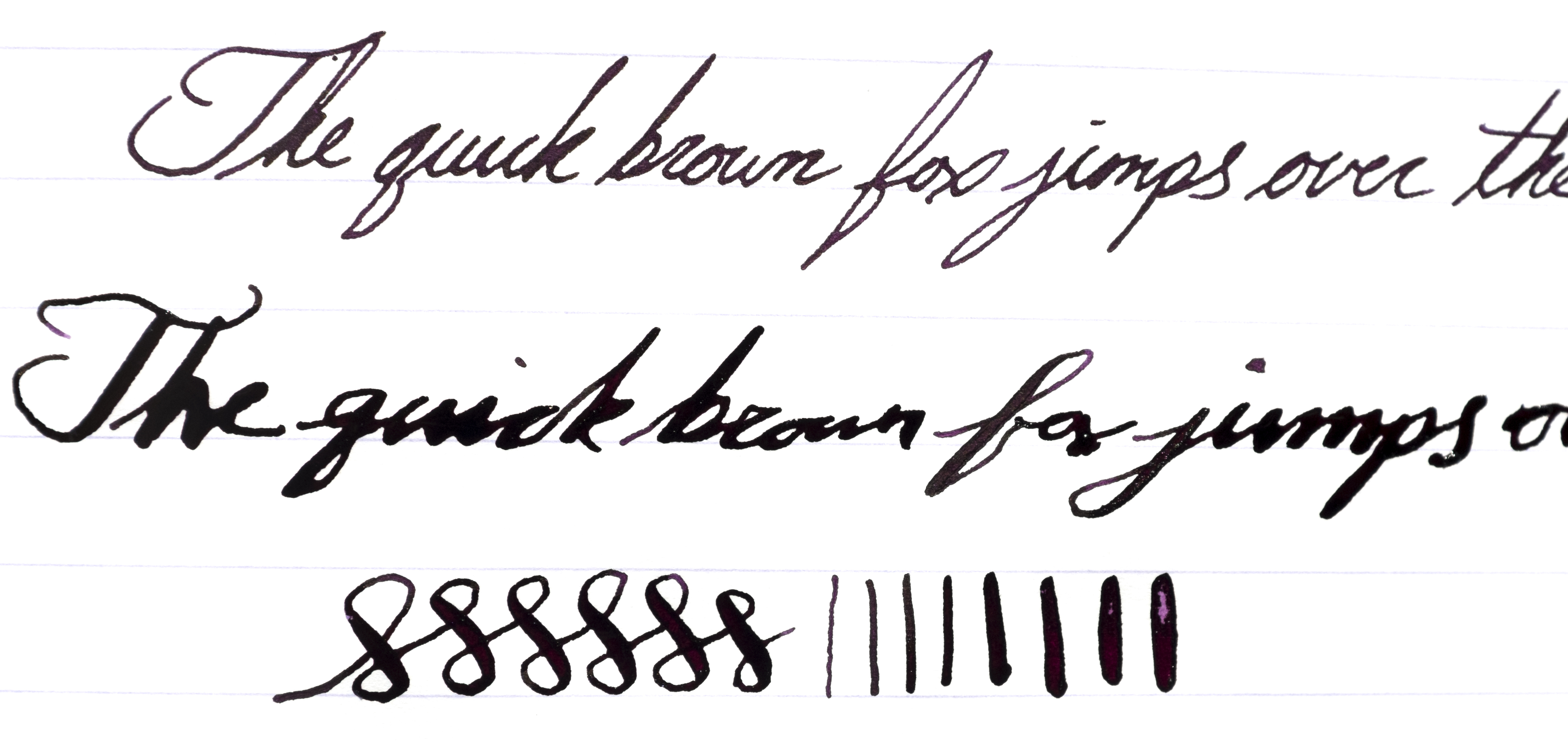
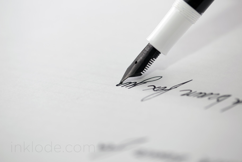 Being labeled an M100, it is easy to assume that this pen is rather small–and you would be right. This pen is not going to be winning any size contests, but it is not dainty. It feels well put together, but it does not seem like a pen that can take too much of a beating. Not that I would run this pen through a rock tumbler, but it is certainly one I will be saving for my desk at home as I have no plans to throw it in my bag and haul it around the world. Despite its small size, it is surprisingly comfortable to hold. Yes, I still prefer larger pens, and no, I probably won’t be using this pen for long writing sessions. But this pen is well balanced enough to be a joy to write with in any normal circumstances. Posting the pen adds a bit of comfortable length to it and does not throw off the balance. The nib is smooth, but provides a decent amount of feedback as well. Someone seeking an ultra-smooth nib best look elsewhere, but if you like to feel the paper you’re writing on a bit, this nib will get you there. No issues with flow or skipping, and honestly finding a pen that is under $100 with a piston that works this well is not an easy task.
Conclusion
The Pelikan M100 “Stormtrooper” White is a small piece of Pelikan history that can be found at relatively low-prices around the internet these days (though this may change into the future). Considering its small size and relatively lightweight body, it may not be suited for everyone, but it is still a great little pen to have and I am delighted to have it in my collection.
Special thank you to Nancy and Christiane at Pelikan US and Pelikan Germany Customer Service respectively for their help in getting me a few more historical details on this pen.
Nib material: Steel
Cap: Screw
Filling mechanism: Piston
Capped Length (Overall): 122 mm
Uncapped Length (Nib tip to end): 117 mm
Posted Length: 144 mm

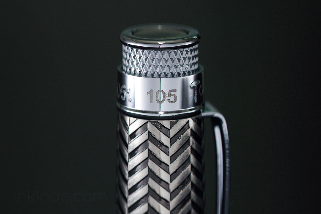
 The pen comes in a simple, friction-fit cardboard tube that has a very nice and sturdy feel to it. A white label is wrapped around the center of the tube with the Massdrop logo as well as a brief history of the pen and the details of how it came to be. On top of the tube, there is a sticker with more information about the model of the pen and so on. The base of the tube has another sticker which indicates the limited edition number of the pen. Looking inside the tube, one will find a foam base that holds the pen upright, foam in the top of the lid to protect the top of the pen in case it shifts around, and a “manual” with the standard international converter folded inside. Overall, the packaging is simple and an elegant solution where more traditional packaging might feel a bit too heavy handed for a pen of this style. Concealed within the pen itself are two mini cartridges containing black ink so you can start writing right away.