i n k l o d e

fountain pens, inks, paper and more

Pilot Petit 1


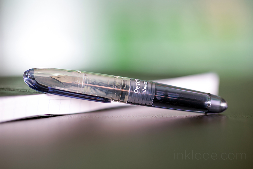
When the hunt begins for affordable and compact fountain pen options, people eventually find themselves staring down a Pilot Petit 1. This pen is both affordable and tiny enough to slip into the tight pockets of a pair of skinny jeans. There are a handful of features that make this quite a fun little pen to have in your pocket. They come in a wide variety of colors—each with their own entertaining name. Unfortunately, several of the colors have been discontinued as the years wore on (and they were very difficult for me to get my hands on!)

Originally the pens came in 12 different colors (named below from left to right):

Correction: It appears that I am actually missing at least two colors from the very first generation. The hunt continues!

Pilot Petit fountain pens

Black
Blue-Black
Blue
Clear Blue
Turquoise (discontinued)
Apple Green
Violet (discontinued)
Baby Pink
Cherry Pink (discontinued)
Red
Mandarin Orange (discontinued)
Apricot Orange


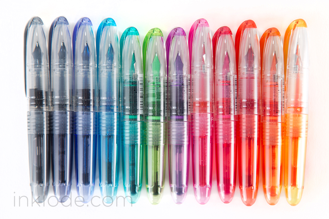
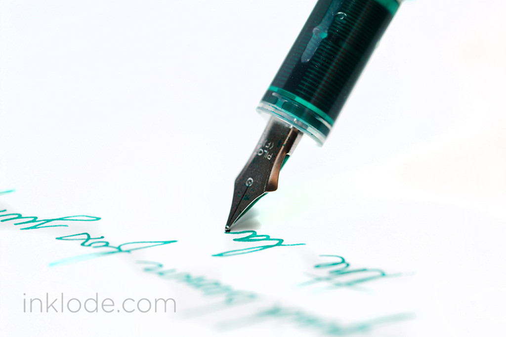
I was also pleasantly surprised to find that the colors of the actual inks were rather close to the colors of the pen bodies. The inks are all very nice—not too wet, not too dry, they go down on the paper smoothly and have no bleeding or feathering that I observed. (More in-depth ink reviews to come later!)Pilot Petit Colors

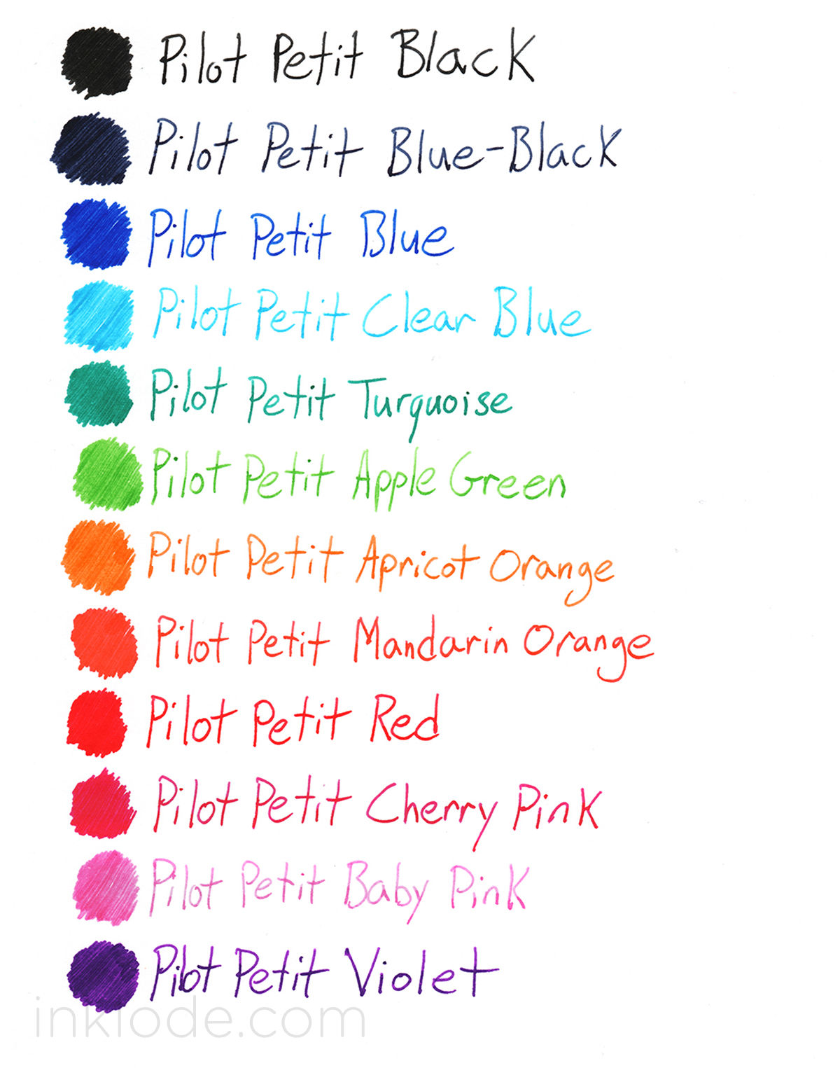
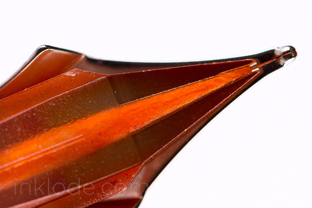
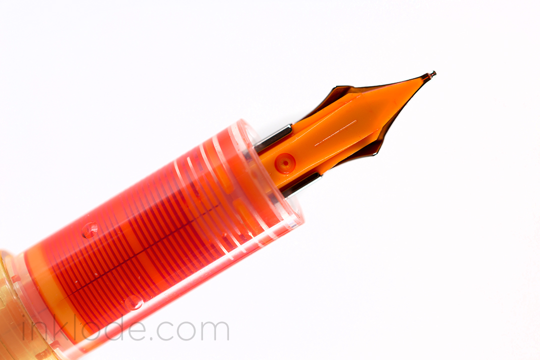
Due to its small size, the pen cap does not post deeply onto the body, but there are little bumps on the back of the pen that allow the cap to securely click into place. Even though the cartridges that it takes are diminutive, they are not terribly expensive and can be refilled with a syringe. For the more adventurous writer, there has been some reported success in turning these pens into eyedroppers, but not every story has been a successful one so proceed at your own risk. However, one of my favorite features of the Pilot Petit 1 is the clear feed. Upon closer inspection, the feed channel appears to be filled with a fibrous material that soaks up the ink (perhaps an effort to prevent drying). The first time you click a cartridge into the pen, you are treated with a view of the ink traveling down the length of the feed and saturating the nib (see video).

Visible fibrous material embedded in feed channel

The current generation of Pilot Petit 1 pens were not the first. The previous iteration of the pen was shorter, had an opaque feed that was the same color as the pen body, and lacked the posting nubs on the back of the pen. However, they still take the same cartridges, and none of the construction materials appear to have been changed. The discontinued pens were discontinued after the previous iteration and therefore the discontinued colors do not exist with the current generation features.

Pilot Petit comparison
Previous generation (top) compared with current generation (bottom)


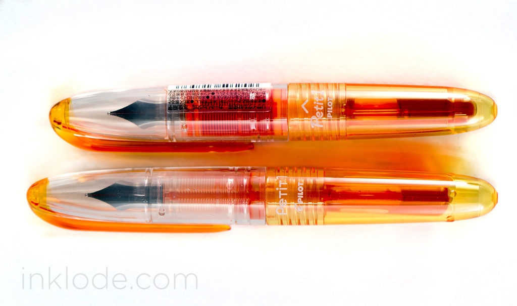
Below you can see the difference between the previous opaque feed and the current transparent feed. Aside from the actual transparency and color difference, the feed does not appear to have been changed in design or functionality. I always enjoy seeing transparent feeds implemented on pens where it is a good fit, and the playfulness of the Pilot Petit makes great use of it.

Pilot Petit opaque feedPilot Petit transparent feed

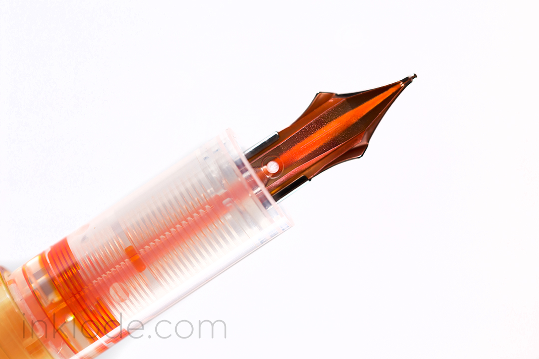
Of course, the real heart of the pen is how it writes, and the Pilot Petit is a fairly standard pen in that regard. Many people reported that their earlier generation pens were scratchy and unpleasant, but I have had no issues with either the previous or current generation as such. The pens are not super smooth, but they aren’t toothy. The feed has no trouble keeping up with any writing I threw at it, and the flow was decent. While the pen is definitely a bit short to write with comfortably, I found that posting it brought it up to a perfectly acceptable length to get some good mileage out of this pen.

Pilot Petit writing


Personally, I think they are perfect little pens to bring along when you need to add a little color to your life in a small package. It is really unfortunate that some of the colors had been discontinued because they were among my favorite ones of the bunch. Regardless, for the price, these petite pens are a wonderfully colorful addition to my collection and I am happy to have them on-hand for the occasional excursion.

Sidenote: The Pilot Petit 1 also comes in a 2 (felt-tip marker) and 3 (brush pen) variety.


This slideshow requires JavaScript.

Like what you see? Subscribe to our newsletter!

Sheaffer Skrip Red

Sheaffer Skrip Red swabSheaffer Skrip Red bottle

Once upon a time, I embarked on a journey that took me from the solemn vaulted halls of Diamine Oxblood to the burning desert of Noodler’s Cayenne—I examined Pelikan Edelstein Ruby and I basked in Montblanc Winter Glow. Then one day I came upon a simple, unassuming jar of ink. My eyes dismissed the packaging and my hands fumbled with the bottle, but when I finally pressed pen to paper, I knew I had found it—the red of reds. An unwavering beacon of chromatic precision that you could set your watch to. Sheaffer Skrip Red.

Dramatic hyperbole aside, Sheaffer Skrip Red is one of the best iterations of a basic, no-frills red colored fountain pen ink that I have used thus far. It has a beautiful, bright red hue that doesn’t seem to lean too far into other color tones. The ink bottle it came in is not my favorite bottle design, but it gets the job done. I find the ink itself to be rather moderate all-around. Flow is moderate with the ink not being too wet or too dry, dry times are moderate to long depending on the pen you’re using, and shading is moderate to minimal. I did not get any bleeding on Rhodia paper even with a flex pen, but unfortunately the ink has zero water resistance properties (like most red inks) and is easily washed away. Considering the bold red color of the ink, I was a bit concerned about staining in my pens, but the ink washed out cleanly without much fuss. If you are looking for a nice, bright, standard-looking red fountain pen ink, Sheaffer Skrip Red is certainly worth trying out (especially considering the affordable prices of Sheaffer inks).

Sheaffer Skrip Red review


This slideshow requires JavaScript.

Like what you see? Subscribe to our newsletter!

Nemosine Singularity

Nemosine is known for producing a few affordable fountain pens in a wide array of colors. The Nemosine Singularity is one of their more popular pen choices. The construction is in keeping with its price range, and while the pen itself feels really lightweight, the plastic feels solid enough to endure every day wear and tear. I chose to purchase the demonstrator version of this pen, and it looks great. There is a single visible seam running along the side of the body and pen cap, but it doesn’t take away from the overall look. The cap screws on easily enough and finds a snug fit so you can be sure it will not uncap itself. In keeping with the affordable nature of the pen, the packaging is kept simple. A small white box adorned with the name of the pen and the Nemosine logo comes filled with the pen itself, a converter, and 6 mini-cartridges.

Nemosine Singularity nib

I find that the pen has a very utilitarian feel to it. Due to the low-price of the pen, I feel very comfortable tossing it into a bag and taking it with me on trips. Although the pen is a bit too light for my liking, it is comfortable in the hand and easy to write with. The cap posts nice and deep so there is no risk of it coming loose and, while the added weight is nice, it does become a little back-heavy. The nib is moderately smooth, but one thing that prevents this from becoming a daily-carry for me is the flow. While the pen can put down a consistent line, I found that it is a fairly dry-writing pen. But many people consider purchasing this pen in order to convert it to an eyedropper. There is a distinct lack of holes in the pen body, so it is ideal for conversion. I would have thought that the screw threads were a bit too far apart, but I have read numerous success stories online, so it’s definitely worth a try. It may not be a must-have but, for the price, this is a great pen for someone looking for a simple, no-frills fountain pen to take to class or jot down notes at work (or convert into an eyedropper!)


Nib material: Steel

Cap: Screw

Filling mechanism: Cartridge/Converter

Overall Length: ~136 mm

This slideshow requires JavaScript.

Like what you see? Subscribe to our newsletter!

Sailor Kingdom Note Tanna JaponensisSailor Kingdom Note Tanna Japonensis

Sailor is well-known for producing exclusive inks for fountain pen shops in Japan. Kingdom Note in Tokyo has a “Biological” ink series that focuses on different types of biological life. Tanna Japonensis is a part of the first series: “Insects.” As a Sailor exclusive ink, it comes in a beautiful ink bottle that Sailor only uses for it’s Japan-exclusive inks. This ink itself is a lovely, warm tone with a soft, mossy green feel to it. I was pleasantly surprised by how much shading is possible with this ink ranging between that light, mossy green to a deeper color reminiscent of the light tapering off as you venture further into the woods. The ink flows wonderfully and goes down on the page wet, but drys very quickly. No bleeding on Rhodia paper unless pushed to the limit with flex or multiple passes. Unfortunately, this ink has zero water resistance properties and is easily washed away with brief exposure. Overall, this is a very nice shade of green that I happily recommend if you can get your hands on a bottle.


Sailor Kingdom Note Tanna Japonensis

This slideshow requires JavaScript.


Like what you see? Subscribe to our newsletter!

[wp_ad_camp_1]

モリタ万年筆店

On an unassuming street in the heart of Osaka, Japan is a small fountain pen shop owned and operated by Seiji Morita (森田 誠ニ). Despite its size, Mr. Morita’s shop has gained popularity within the international fountain pen community for his fair pricing, excellent service, and special exclusive inks and pens made specifically for his shop. During my latest visit to Osaka, I decided to dedicate some time to speak with Mr. Morita about his store and about fountain pens in general. It was a warm summer’s day, heavy with humidity and the sound of cicadas filling the air. In his small air conditioned shop, I inquired about the history of the store as he quietly went about his business of adjusting displays and delicately cleaning pens.

The Morita Fountain Pen Shop was originally opened by Mr. Morita’s father in 1946 during the period of post-WWII reconstruction. Although a large portion of the country was based in agriculture, a shift towards heavy industry and technology was just over the horizon. At the time, many Japanese businessmen needed fountain pens in order to sign contracts and other business related materials—items like fountain pens and lighters were even more prominent status symbols in the business world than they are today. Parker fountain pens, in particular, were highly sought after. Therefore, opening a store that catered to these up-and-coming professionals seemed like a lucrative business prospect. Although the exact location has changed slightly over the years, the shop has never strayed far from Kitahama Station.


The shop has a wide assortment of pens on display


Over the decades, technology has transformed fountain pens from a ubiquitous tool used almost daily, into a niche hobby by a sizable community of collectors and writers. Undeterred by the overwhelming digitization of communication, Mr. Morita remains resolved in his thought that the unique experience of writing with fountain pens will continue to draw in new members to the ranks. He explained that his shop is visited by both the young and old alike, and he believes that since young people usually communicate with cellphones and the internet, they become interested in fountain pens because it is something different and unusual. Even though the world of communication has become inexorably digitized, new faces always seem to find their way into the world of pens and inks.


Even in the face of online shopping eclipsing physical stores in popularity, he reasserts the importance of trying out fountain pens before you purchase them. Each pen has a different weight and feel, and each nib has its own properties that may be better suited to one person’s tastes over another’s. And, like any good shop owner, he enjoys his work for the satisfaction and smiles of his customers when they find the right pen. It is difficult to say if running a physical shop will be sustainable into the distant future, but for now Mr. Morita seems more than happy to dedicate his time and efforts into bringing something personal and unique to the fountain pen world.

If you ever find yourself in Osaka, I highly recommend paying Mr. Morita a visit. He is very kind and accommodating, and his shop has two exclusive ink colors made by Sailor (Shade Green and Wine) as well as an exclusive color Sailor Professional Gear and Professional Gear Slim. The colors for the inks and pens were personally chosen by Mr. Morita and certainly add to the experience of visiting his shop.


The two Sailor ink colors made exclusively for the Morita Pen Shop


I asked Mr. Morita if he’d be willing to pose for a photo but he politely declined. Regardless, I want to thank him for taking the time to speak to me, and for allowing me to take some photos of his shop!

And a special thank you to my interpreter, Takashi Komatsu! 


Website: http://morita.ne.jp/

E-mail: pen@morita.ne.jp

Directions: The Morita Fountain Pen Shop (モリタ万年筆店) is located in the Chūō-ku ward (中央区) of Osaka (大阪) just out of Kitahama Station (北浜駅). Come out of exit 6 and turn left. Walk to the first corner and take another left and you will see the shop on the left side of the road. It’s really easy to get to, but I took some photos just in case. Kitahama Station is located on the Osaka Municipal Subway lines, not the JR lines. If you are coming from Osaka Station, you will have to make a transfer. If you prefer physical activity, you may consider walking as there are a few interesting things to see along the way.

Come out of exit 6 at Kitahama Station and turn left
Go to the first corner and turn left
You will see the shop on the left side of the street.

Like what you see? Subscribe to our newsletter!

Muji Aluminum Round Fountain Pen


Muji is a popular retail company that has spread across the globe with their policies of simple design, use of recycled materials, and the omission of branding on their goods. They carry a wide variety of items from bookshelves and bed sheets, to t-shirts and travel bags. Within their vast assortment of items is the Muji Aluminum Round Fountain Pen. True to their word, this pen has no branding and takes on a simple form out of lightweight aluminum. My first impression, upon holding the pen, was that it felt cheaper than I had expected. Although the pen is made of metal, it feels quite light. The body is actually rather thin in some places, but that is not to say that it isn’t sturdy. It feels well constructed and can probably stand up to a good amount of daily wear, but perhaps not as much as a pen machined from stainless steel, of course.

The pen is well balanced and the cap has been machined in a way that the metal circle along the bottom of the cap slides into a mirrored circular gap along the back of the pen. Along with the fact that the cap weighs very little, this means that the pen posts perfectly and is actually one of the few pens that I prefer to write with posted (it feels a tiny bit too light without the cap). The knurled metal grip section has been a point of contention for some, but I have found it pleasant to hold and rather comfortable, in the grand scheme of things. The only issue I had was the fact that the body is actually quite thin and I generally prefer larger pens, but that is a personal preference.

Despite the low-price of the pen (under $20 USD), the nib is actually incredibly smooth. It is adorned with some generic scroll work and reads, “Iridium Point.” Regardless of its place of origin, the writing experience says it all. The nib glides across the paper with ease and the feed keeps up perfectly. I have had no issues with flow or skipping.


This slideshow requires JavaScript.

Like what you see? Subscribe to our newsletter!

Pelikan Edelstein TurmalinePelikan Edelstein Turmaline bottle

Starting in 2012, Pelikan began releasing a limited edition Edelstein series ink each year. Pelikan Edelstein Turmaline was the first “Ink of the Year” that came out, and it is a notably vibrant pinkish-purple. Like the rest of the Edelstein ink series, Turmaline comes in a magnificently lovely glass bottle with a plastic cap. Many of the Edelstein inks have notably muted tones and aren’t particularly bright or eye-searing despite their lustrous names. However, Turmaline finds a nice balance between this softer palette and the eye-catching pop of a pinkish-purple ink. There were no flow issues and the ink went down on the page with moderate wetness. The color does have some flexibility stretching from a lighter pink shade to a deeper, rich purple. Being a bit of an ostentatious color, Turmaline might not be an ink that you’ll always have in your pens, but it is still a very nice color in a well-rounded package. Seeing as how it was limited to the year 2012, it is now very difficult to find, but if you find a bottle, you won’t be disappointed!


Pelikan Edelstein Turmaline review

This slideshow requires JavaScript.

Like what you see? Subscribe to our newsletter!

Pelikan Twist

Pelikan Twist


The Pelikan Twist is an entry level fountain pen offering that is relatively affordable and quite functional. Initially, the color schemes and aesthetics didn’t seem very appealing, but I eventually came to appreciate the uniqueness of the design for a starter pen. I chose the 2014 limited edition “Petrol and Apricot” color with a fine nib (also comes in medium). Constructed entirely of plastic, the Twist feels sturdy but lightweight. The plastic itself seems like it could handle daily wear and tear rather well, but perhaps won’t stand the test of time after many years of heavy use. When squeezed, the body does not flex, but the cap will. The cap slips on with a satisfying click and I think it’s kind of fun how you need to follow the twist of the pen while uncapping. However, I could understand why this might be slightly worrisome to others as the rubber of the grip section could become worn down if you let the grip rub against the inside of the cap constantly.

Pelikan Twist

Generally speaking, I find no appeal in grip sections that have predetermined locations for you to place your fingers, but the Twist is surprisingly comfortable to hold in spite of this. The rubber has a sort of soft-touch, smooth, plasticky feel to it. Depending on where you purchase the pen, it may or may not come with a converter. The pen is well balanced and actually looks about as heavy as I was expecting it to be. While the cap will sit on the back of the pen, it does not post securely by any means. The steel nib is a wonderfully wet writer and was smoother than I was expecting for an entry level pen. This may not be an essential pen for your collection, but I am all for more affordable options being available and the Pelikan Twist holds its own rather well. If you’re searching for an affordable pen, this is certainly worth a look!


Nib material: Steel

Cap: Snap

Filling mechanism: Cartridge/Converter

Overall Length: 139 mm

This slideshow requires JavaScript.

Like what you see? Subscribe to our newsletter!

Sailor Jentle Apricot

Sailor ApricotSailor Apricot bottle


Sailor Jentle Apricot is a stunningly bright and vibrant orange ink that leaps off of the page and grabs your attention. I don’t usually gravitate towards orange inks, but Apricot is so eye-catching that I couldn’t help but become captivated by it. The color is so vivid that the ink almost glows on the white field of the paper. The shading is slight but notable as it undulates from a delectably indulgent crimson orange to a softer apricot color. I absolutely love the way this ink looks with a flex nib. There is even a bit of a gloss to the ink when it is allowed to pool up, but this is not likely to manifest itself in regular writing. Flow is good across the board, dry times are average and it behaves as admirably as any other Sailor ink I have tried. However, the ink does not stand a chance against water and is easily washed away upon exposure. Unfortunately, as of early 2014, Sailor Apricot has been discontinued along with the rest of that generation of Jentle inks. I am truly sad to see it go, but perhaps it will make a re-appearance again in the future. I highly recommend this ink if you can find any!


Sailor Apricot

This slideshow requires JavaScript.


Like what you see? Subscribe to our newsletter!

Rohrer & Klingner ScabiosaRohrer & Klingner Scabiosa Bottle


Rohrer & Klingner Scabiosa is a difficult ink to capture digitally. The ink is a somewhat muted and dusty purple that brings to mind a late sunset shielded by the clouds of a waning storm. It’s a somewhat melancholy ink color that possesses some interesting subtle features. As an iron gall ink, the water resistant properties are superb and can survive exposure with full legibility. Dry times are average and the ink goes down on the paper with a moderate amount of wetness and zero flow issues. One thing that I have taken note of is that this ink seems to slightly shift color as it ages on paper, which you may notice happening in some of my photos. When it is still fresh, the color has more of a cool gray tone to it, whereas once it’s been allowed to age, it acquires a slightly warmer tone. I’ve always had a thing for dusty purple inks, and the iron gall aspect adds quite a bit of appeal for me. I think this is one of those inks that can really grow on you if you give it time. I definitely recommend trying it out if you like these kinds of purples!

Special thanks to The Goulet Pen Company for sending me this bottle of Rohrer & Klingner Scabiosa! Although this ink was provided at no cost, this review contains my 100% honest and unfettered opinion.


Rohrer & Klingner Scabiosa Review


This slideshow requires JavaScript.

Like what you see? Subscribe to our newsletter!