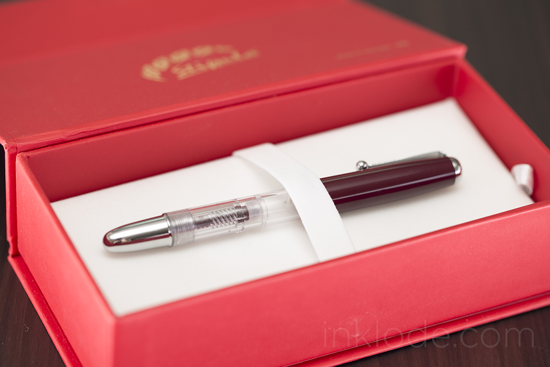
i n k l o d e

fountain pens, inks, paper and more

Posts in the review category

Parker Urban

Parker Urban


Throughout fountain pen history, the Parker pen brand has been associated with some amazingly beautiful fine writing instruments. Today, Parker pens have found a much more humble following of fans and enthusiasts. Part of the reason for this shift may be due to the fact that Parker have downplayed their role in making entry-level fountain pens and have been focusing on their higher-end luxury lines. However, that isn’t to say that they have completely abandoned the more affordable price ranges. The Parker Urban is a perfect example of a fountain pen that is both sleek and reliable.

Appearance and Design

Parker_Urban_003

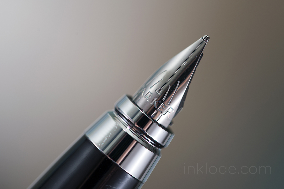
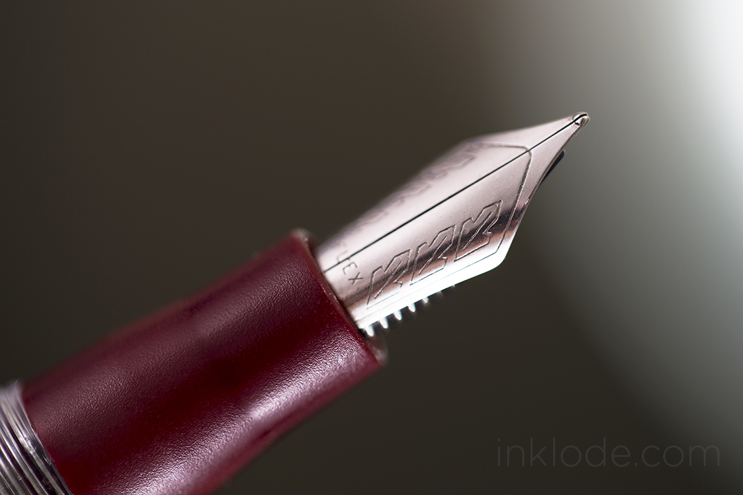
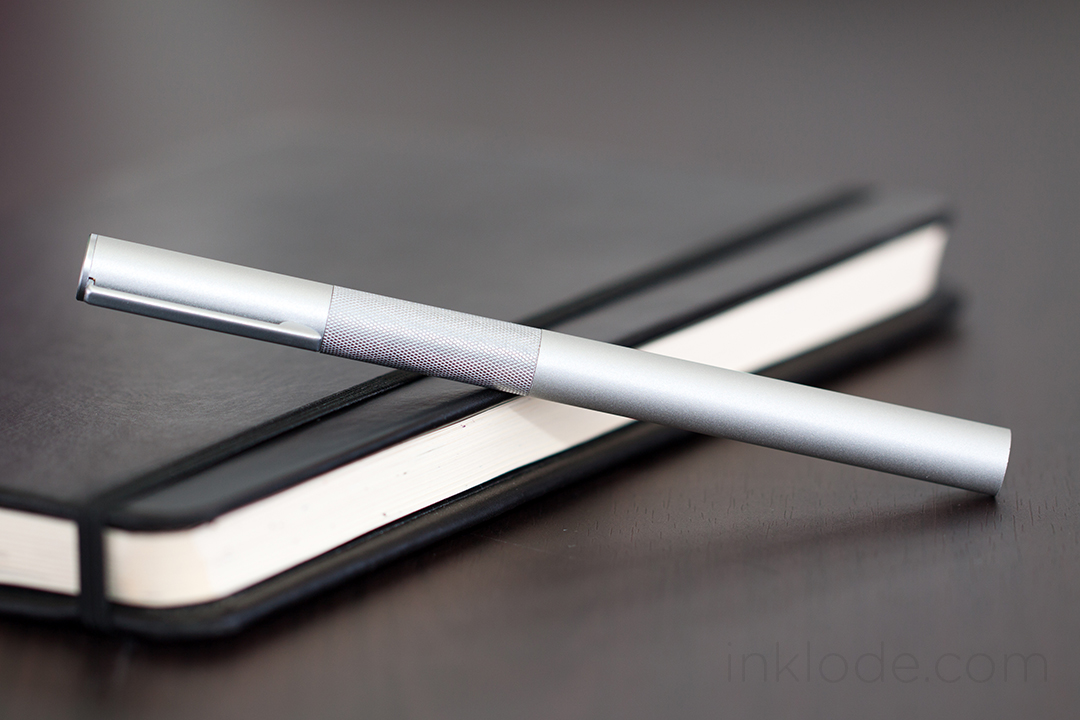
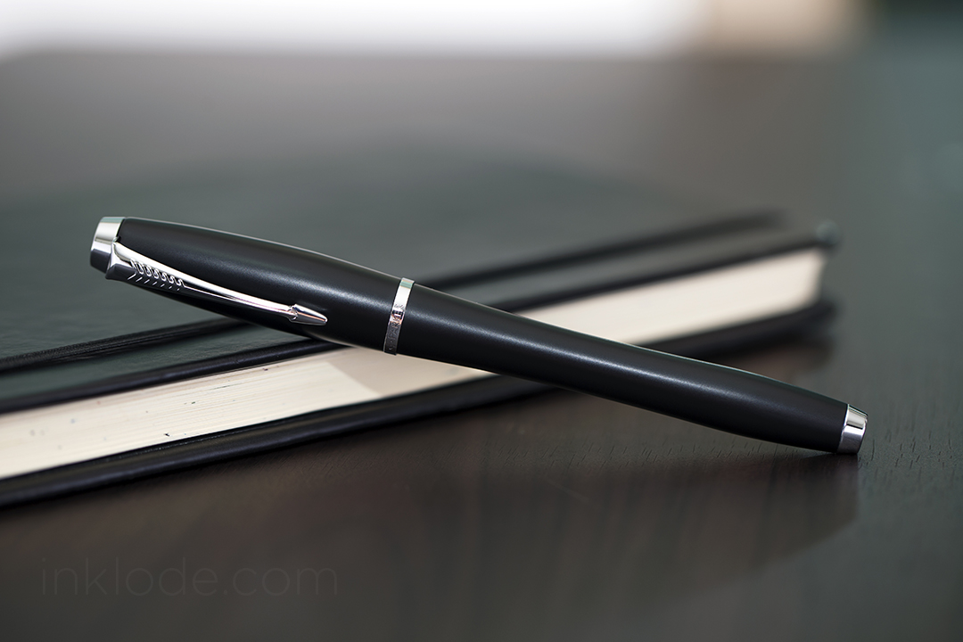
The Parker Urban features a sleek, elongated pear-shape where the undulated contour of the barrel and cap make the pen seem like the body was given a slight squeeze towards the back. I find this design to be very appealing and the pen feels really nice to hold. Gripping the pen is easy and, while some may find the step down from the grip to the barrel to be too steep, the grip does not feel slippery or uncomfortable to write with. While Parker saw fit to make the pen in a variety of colors, I still found myself drawn to the matte black with silver trim. The snap-on cap features Parker’s iconic arrow clip and the bottom cap band is engraved with the word “Parker” accompanied by their logo. The back of the pen is balanced out with silver trim to balance out the trim on the cap. Most of the pen is constructed of steel which gives the pen a good amount of heft. The pen itself is well constructed and I found no flaws or blemishes from the manufacturing process. The nib is incredibly small and seems like it was given the appearance of a hooded nib without actually being one. The feed is simple in appearance and is equally small to match the nib. Nib decoration is a few simple markings with the word Parker engraved across it. Posting is easy and the cap feels somewhat secure, but a good jostling could certainly convince the cap to go flying off into the ether. The pen is accompanied by a plunger-style converter and also accepts cartridges.

Writing Experience

Parker Urban writing

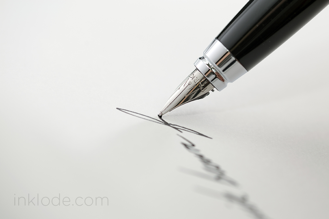
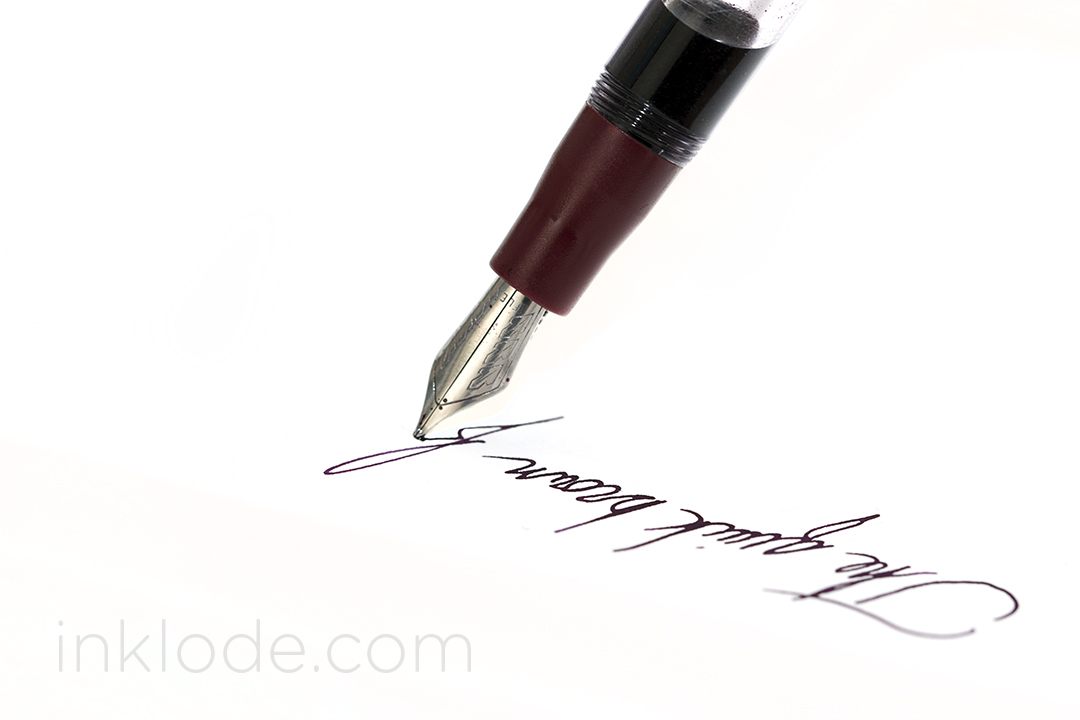
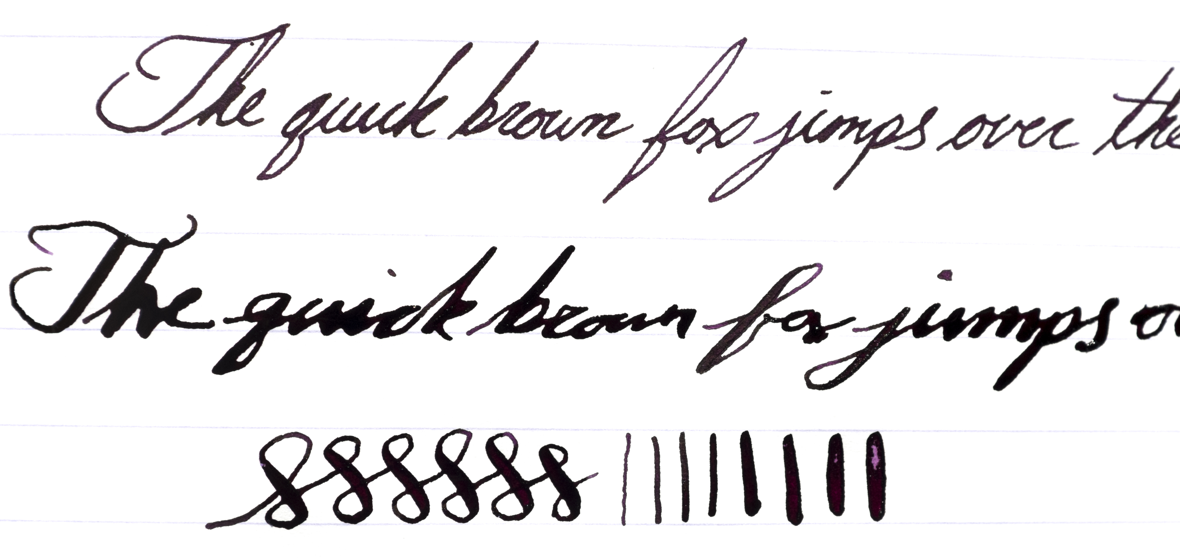
Despite the nature of the construction material, the Parker Urban does not feel too hefty to write with. While posting the pen does make it feel a bit too back-heavy, it is not nearly as uncomfortable as posting some other all-metal pens I have used previously. The nib, though small, puts down a very smooth and wet line. While you may be able to coax a tiny bit of flex out of it, the nib is certainly not designed for it and I do not recommend flexing it. That being said, the pen can be comfortable to write with for extended writing sessions and will put down a consistent amount of ink. The feed seems to have no trouble keeping up and I have never had any experiences where the pen skipped or ran dry.

Conclusion

The Parker Urban may not be as fancy as a Parker Vacumatic of old, but it is a smooth writing pen that comes in a sleek and stylish design. Although the price may seem a bit high, I still think I can give this pen my recommendation. It is a fun, yet classy, looking pen that could certainly become a sturdy every-day-carry. So if you already have a few pens in your arsenal and are looking to try out an affordable, modern Parker pen, the Urban is worth a look.

This slideshow requires JavaScript.

Stipula Splash

Stipula Splash

The Stipula Splash hit the market in late 2014 with the marketing materials focused on the fact that it was a piston-filled demonstrator pen with a mini “V-flex” nib with an MSRP of $79 USD from the Italian pen manufacturer.

Packaging

Stipula Splash packaging

The box it arrived in was a sturdy, red-colored cardboard box with a magnetic flap to keep it closed. Inside was a faux-velvet pad with a strap to secure the pen in place. The space beneath the pad housed the manual which detailed how to care for and fill the pen in both English and Italian. The packaging was nothing particularly special, but it was perfectly adequate for keeping the pen safe on its journey. Though, I do feel the box may have been a tad larger than necessary and the strap securing the pen does not do the best job at preventing it from sliding around.

Appearance and Design

Stipula Splash v-flex nib

The pen is lighter than I had anticipated. The plastic material out of which it is constructed feels very light-weight and potentially fragile. While the body might be able to take some hits, the cap feels particularly vulnerable to cracking if mishandled. I ordered the Stipula Splash in the lovely Bordeaux color scheme. The cap and grip section are the only colored parts of the pen as the barrel is clear, the piston is transparent, and the piston knob is polished metal. Personally, I wish the piston knob was a matching shade of Bordeaux to balance out the appearance of the pen. The Stipula leaf logo sits in relief on the flattened top of the cap which gives way to a simple, but sturdy, clip. There is one single metal band wrapped around the cap near the base and looks to be made of a cheaper material than the rest of the metal on the pen. Once posted, I find the pen looks much more appealing with the beautifully clear barrel sandwiched between the colors of the cap and grip section. Although the piston knob is solid metal, the relatively short length of the pen helps prevent it from feeling back heavy when it isn’t posted. However, posting the pen adds a comfortable length but also tips the scale towards making the pen uncomfortably back-heavy. The nib is very small and is split down the center to allow for flexing of the steel tines and is adorned with a simple repetition of the Stipula leaf logo that is subtle and elegant. One thing that could double as a pro or a con is the lack of long threads for the screw-on pen cap. It only takes 1/2 a turn of the cap to remove it. While this does raise some concerns about the pen uncapping itself if one were to carry it in a pocket, I can appreciate this design as it does make uncapping and re-capping the pen effortless and allows me to start writing quickly when I need to. Though I have heard complaints about leaking, I have not seen any such issues with my version of the pen. It can hold a good amount of ink, but due to the way it is constructed, I was unable to completely fill the reservoir with ink normally.

Writing Experience

Writing

Although this pen has been touted as housing a mini-flex nib, the small size of the pen and nib means any significant flexing requires a lot of pressure when writing. This becomes somewhat of an issue due to the fact that the nib itself is rather scratchy. Attempting to flex the nib makes me feel like I am going to tear into the paper at times. That being said, the amount of flex possible seems to be similar to that of the Noodler’s Ahab steel flex (even though the Noodler’s flex nib is much larger). I ran into a lot of railroading while attempting to flex this nib even after some minor adjustments, but the feed and nib keep up wonderfully with normal writing. As the ink reservoir gets low, the pen starts dropping more ink while writing. This may become a nuisance if the ink you are writing with is already quite wet or if it has longer dry times. After spending some time with the pen, I found that I became used to the (incredibly) narrow sweet spot where the nib doesn’t feel so scratchy and I have had a rather pleasant experience writing with the pen normally (as in not flexing the nib). The grip section is tiny, so if you have larger hands or prefer larger pens, this is definitely not for you. The good news is, the threads do not get in the way or feel uncomfortable.

Stipula Splash writing sample
Please pardon the sloppy flex writing.

As you can see, the nib lays down a nice wet “fine” line with normal writing. As I attempt to flex the pen, I occasionally run into difficulties where the feed becomes rather inconsistent in how much ink it is laying out (sometimes too much, sometimes to little). That being said, the amount of flex possible is rather nice but it simply requires too much pressure for it to be a comfortable experience.

Conclusion

The Stipula Splash seems to accomplish a multitude of things with the mini-flex nib, the “demonstrator” style ink reservoir, the piston filling mechanism, and the small compact size. They manage to fit a lot into a small package, but for the price I would expect this pen to feel a little more solid in the hand. I think this is a case of “jack of all trades, master of none” where the Stipula Splash comes with lots features, but none of them really stand out as exceptional (and some of them are just plain disappointing). That being said, I honestly don’t think it is a terrible pen, but I do think that Stipula is asking for a lot of money for what you get.


Nib material: Steel (v-flex)

Cap: Screw

Filling mechanism: Piston

Overall Length: 126 mm


Special thanks to Pen Chalet for sending me this Stipula Splash! Although this pen was provided at no cost, this review contains my 100% honest and unfettered opinion.

This slideshow requires JavaScript.

Like what you see? Subscribe to our newsletter!

Pilot Petit 1


When the hunt begins for affordable and compact fountain pen options, people eventually find themselves staring down a Pilot Petit 1. This pen is both affordable and tiny enough to slip into the tight pockets of a pair of skinny jeans. There are a handful of features that make this quite a fun little pen to have in your pocket. They come in a wide variety of colors—each with their own entertaining name. Unfortunately, several of the colors have been discontinued as the years wore on (and they were very difficult for me to get my hands on!)

Originally the pens came in 12 different colors (named below from left to right):

Correction: It appears that I am actually missing at least two colors from the very first generation. The hunt continues!

Pilot Petit fountain pens

Black
Blue-Black
Blue
Clear Blue
Turquoise (discontinued)
Apple Green
Violet (discontinued)
Baby Pink
Cherry Pink (discontinued)
Red
Mandarin Orange (discontinued)
Apricot Orange


I was also pleasantly surprised to find that the colors of the actual inks were rather close to the colors of the pen bodies. The inks are all very nice—not too wet, not too dry, they go down on the paper smoothly and have no bleeding or feathering that I observed. (More in-depth ink reviews to come later!)Pilot Petit Colors

Due to its small size, the pen cap does not post deeply onto the body, but there are little bumps on the back of the pen that allow the cap to securely click into place. Even though the cartridges that it takes are diminutive, they are not terribly expensive and can be refilled with a syringe. For the more adventurous writer, there has been some reported success in turning these pens into eyedroppers, but not every story has been a successful one so proceed at your own risk. However, one of my favorite features of the Pilot Petit 1 is the clear feed. Upon closer inspection, the feed channel appears to be filled with a fibrous material that soaks up the ink (perhaps an effort to prevent drying). The first time you click a cartridge into the pen, you are treated with a view of the ink traveling down the length of the feed and saturating the nib (see video).

Visible fibrous material embedded in feed channel

The current generation of Pilot Petit 1 pens were not the first. The previous iteration of the pen was shorter, had an opaque feed that was the same color as the pen body, and lacked the posting nubs on the back of the pen. However, they still take the same cartridges, and none of the construction materials appear to have been changed. The discontinued pens were discontinued after the previous iteration and therefore the discontinued colors do not exist with the current generation features.

Pilot Petit comparison
Previous generation (top) compared with current generation (bottom)


Below you can see the difference between the previous opaque feed and the current transparent feed. Aside from the actual transparency and color difference, the feed does not appear to have been changed in design or functionality. I always enjoy seeing transparent feeds implemented on pens where it is a good fit, and the playfulness of the Pilot Petit makes great use of it.

Pilot Petit opaque feedPilot Petit transparent feed

Of course, the real heart of the pen is how it writes, and the Pilot Petit is a fairly standard pen in that regard. Many people reported that their earlier generation pens were scratchy and unpleasant, but I have had no issues with either the previous or current generation as such. The pens are not super smooth, but they aren’t toothy. The feed has no trouble keeping up with any writing I threw at it, and the flow was decent. While the pen is definitely a bit short to write with comfortably, I found that posting it brought it up to a perfectly acceptable length to get some good mileage out of this pen.

Pilot Petit writing


Personally, I think they are perfect little pens to bring along when you need to add a little color to your life in a small package. It is really unfortunate that some of the colors had been discontinued because they were among my favorite ones of the bunch. Regardless, for the price, these petite pens are a wonderfully colorful addition to my collection and I am happy to have them on-hand for the occasional excursion.

Sidenote: The Pilot Petit 1 also comes in a 2 (felt-tip marker) and 3 (brush pen) variety.


This slideshow requires JavaScript.

Like what you see? Subscribe to our newsletter!

Sheaffer Skrip Red

Sheaffer Skrip Red swabSheaffer Skrip Red bottle

Once upon a time, I embarked on a journey that took me from the solemn vaulted halls of Diamine Oxblood to the burning desert of Noodler’s Cayenne—I examined Pelikan Edelstein Ruby and I basked in Montblanc Winter Glow. Then one day I came upon a simple, unassuming jar of ink. My eyes dismissed the packaging and my hands fumbled with the bottle, but when I finally pressed pen to paper, I knew I had found it—the red of reds. An unwavering beacon of chromatic precision that you could set your watch to. Sheaffer Skrip Red.

Dramatic hyperbole aside, Sheaffer Skrip Red is one of the best iterations of a basic, no-frills red colored fountain pen ink that I have used thus far. It has a beautiful, bright red hue that doesn’t seem to lean too far into other color tones. The ink bottle it came in is not my favorite bottle design, but it gets the job done. I find the ink itself to be rather moderate all-around. Flow is moderate with the ink not being too wet or too dry, dry times are moderate to long depending on the pen you’re using, and shading is moderate to minimal. I did not get any bleeding on Rhodia paper even with a flex pen, but unfortunately the ink has zero water resistance properties (like most red inks) and is easily washed away. Considering the bold red color of the ink, I was a bit concerned about staining in my pens, but the ink washed out cleanly without much fuss. If you are looking for a nice, bright, standard-looking red fountain pen ink, Sheaffer Skrip Red is certainly worth trying out (especially considering the affordable prices of Sheaffer inks).

Sheaffer Skrip Red review


This slideshow requires JavaScript.

Like what you see? Subscribe to our newsletter!

Nemosine Singularity

Nemosine is known for producing a few affordable fountain pens in a wide array of colors. The Nemosine Singularity is one of their more popular pen choices. The construction is in keeping with its price range, and while the pen itself feels really lightweight, the plastic feels solid enough to endure every day wear and tear. I chose to purchase the demonstrator version of this pen, and it looks great. There is a single visible seam running along the side of the body and pen cap, but it doesn’t take away from the overall look. The cap screws on easily enough and finds a snug fit so you can be sure it will not uncap itself. In keeping with the affordable nature of the pen, the packaging is kept simple. A small white box adorned with the name of the pen and the Nemosine logo comes filled with the pen itself, a converter, and 6 mini-cartridges.

Nemosine Singularity nib

I find that the pen has a very utilitarian feel to it. Due to the low-price of the pen, I feel very comfortable tossing it into a bag and taking it with me on trips. Although the pen is a bit too light for my liking, it is comfortable in the hand and easy to write with. The cap posts nice and deep so there is no risk of it coming loose and, while the added weight is nice, it does become a little back-heavy. The nib is moderately smooth, but one thing that prevents this from becoming a daily-carry for me is the flow. While the pen can put down a consistent line, I found that it is a fairly dry-writing pen. But many people consider purchasing this pen in order to convert it to an eyedropper. There is a distinct lack of holes in the pen body, so it is ideal for conversion. I would have thought that the screw threads were a bit too far apart, but I have read numerous success stories online, so it’s definitely worth a try. It may not be a must-have but, for the price, this is a great pen for someone looking for a simple, no-frills fountain pen to take to class or jot down notes at work (or convert into an eyedropper!)


Nib material: Steel

Cap: Screw

Filling mechanism: Cartridge/Converter

Overall Length: ~136 mm

This slideshow requires JavaScript.

Like what you see? Subscribe to our newsletter!

Sailor Kingdom Note Tanna JaponensisSailor Kingdom Note Tanna Japonensis

Sailor is well-known for producing exclusive inks for fountain pen shops in Japan. Kingdom Note in Tokyo has a “Biological” ink series that focuses on different types of biological life. Tanna Japonensis is a part of the first series: “Insects.” As a Sailor exclusive ink, it comes in a beautiful ink bottle that Sailor only uses for it’s Japan-exclusive inks. This ink itself is a lovely, warm tone with a soft, mossy green feel to it. I was pleasantly surprised by how much shading is possible with this ink ranging between that light, mossy green to a deeper color reminiscent of the light tapering off as you venture further into the woods. The ink flows wonderfully and goes down on the page wet, but drys very quickly. No bleeding on Rhodia paper unless pushed to the limit with flex or multiple passes. Unfortunately, this ink has zero water resistance properties and is easily washed away with brief exposure. Overall, this is a very nice shade of green that I happily recommend if you can get your hands on a bottle.


Sailor Kingdom Note Tanna Japonensis

This slideshow requires JavaScript.


Like what you see? Subscribe to our newsletter!

Muji Aluminum Round Fountain Pen


Muji is a popular retail company that has spread across the globe with their policies of simple design, use of recycled materials, and the omission of branding on their goods. They carry a wide variety of items from bookshelves and bed sheets, to t-shirts and travel bags. Within their vast assortment of items is the Muji Aluminum Round Fountain Pen. True to their word, this pen has no branding and takes on a simple form out of lightweight aluminum. My first impression, upon holding the pen, was that it felt cheaper than I had expected. Although the pen is made of metal, it feels quite light. The body is actually rather thin in some places, but that is not to say that it isn’t sturdy. It feels well constructed and can probably stand up to a good amount of daily wear, but perhaps not as much as a pen machined from stainless steel, of course.

The pen is well balanced and the cap has been machined in a way that the metal circle along the bottom of the cap slides into a mirrored circular gap along the back of the pen. Along with the fact that the cap weighs very little, this means that the pen posts perfectly and is actually one of the few pens that I prefer to write with posted (it feels a tiny bit too light without the cap). The knurled metal grip section has been a point of contention for some, but I have found it pleasant to hold and rather comfortable, in the grand scheme of things. The only issue I had was the fact that the body is actually quite thin and I generally prefer larger pens, but that is a personal preference.

Despite the low-price of the pen (under $20 USD), the nib is actually incredibly smooth. It is adorned with some generic scroll work and reads, “Iridium Point.” Regardless of its place of origin, the writing experience says it all. The nib glides across the paper with ease and the feed keeps up perfectly. I have had no issues with flow or skipping.


This slideshow requires JavaScript.

Like what you see? Subscribe to our newsletter!

Pelikan Twist

Pelikan Twist


The Pelikan Twist is an entry level fountain pen offering that is relatively affordable and quite functional. Initially, the color schemes and aesthetics didn’t seem very appealing, but I eventually came to appreciate the uniqueness of the design for a starter pen. I chose the 2014 limited edition “Petrol and Apricot” color with a fine nib (also comes in medium). Constructed entirely of plastic, the Twist feels sturdy but lightweight. The plastic itself seems like it could handle daily wear and tear rather well, but perhaps won’t stand the test of time after many years of heavy use. When squeezed, the body does not flex, but the cap will. The cap slips on with a satisfying click and I think it’s kind of fun how you need to follow the twist of the pen while uncapping. However, I could understand why this might be slightly worrisome to others as the rubber of the grip section could become worn down if you let the grip rub against the inside of the cap constantly.

Pelikan Twist

Generally speaking, I find no appeal in grip sections that have predetermined locations for you to place your fingers, but the Twist is surprisingly comfortable to hold in spite of this. The rubber has a sort of soft-touch, smooth, plasticky feel to it. Depending on where you purchase the pen, it may or may not come with a converter. The pen is well balanced and actually looks about as heavy as I was expecting it to be. While the cap will sit on the back of the pen, it does not post securely by any means. The steel nib is a wonderfully wet writer and was smoother than I was expecting for an entry level pen. This may not be an essential pen for your collection, but I am all for more affordable options being available and the Pelikan Twist holds its own rather well. If you’re searching for an affordable pen, this is certainly worth a look!


Nib material: Steel

Cap: Snap

Filling mechanism: Cartridge/Converter

Overall Length: 139 mm

This slideshow requires JavaScript.

Like what you see? Subscribe to our newsletter!

Sailor Jentle Apricot

Sailor ApricotSailor Apricot bottle


Sailor Jentle Apricot is a stunningly bright and vibrant orange ink that leaps off of the page and grabs your attention. I don’t usually gravitate towards orange inks, but Apricot is so eye-catching that I couldn’t help but become captivated by it. The color is so vivid that the ink almost glows on the white field of the paper. The shading is slight but notable as it undulates from a delectably indulgent crimson orange to a softer apricot color. I absolutely love the way this ink looks with a flex nib. There is even a bit of a gloss to the ink when it is allowed to pool up, but this is not likely to manifest itself in regular writing. Flow is good across the board, dry times are average and it behaves as admirably as any other Sailor ink I have tried. However, the ink does not stand a chance against water and is easily washed away upon exposure. Unfortunately, as of early 2014, Sailor Apricot has been discontinued along with the rest of that generation of Jentle inks. I am truly sad to see it go, but perhaps it will make a re-appearance again in the future. I highly recommend this ink if you can find any!


Sailor Apricot

This slideshow requires JavaScript.


Like what you see? Subscribe to our newsletter!

Rohrer & Klingner ScabiosaRohrer & Klingner Scabiosa Bottle


Rohrer & Klingner Scabiosa is a difficult ink to capture digitally. The ink is a somewhat muted and dusty purple that brings to mind a late sunset shielded by the clouds of a waning storm. It’s a somewhat melancholy ink color that possesses some interesting subtle features. As an iron gall ink, the water resistant properties are superb and can survive exposure with full legibility. Dry times are average and the ink goes down on the paper with a moderate amount of wetness and zero flow issues. One thing that I have taken note of is that this ink seems to slightly shift color as it ages on paper, which you may notice happening in some of my photos. When it is still fresh, the color has more of a cool gray tone to it, whereas once it’s been allowed to age, it acquires a slightly warmer tone. I’ve always had a thing for dusty purple inks, and the iron gall aspect adds quite a bit of appeal for me. I think this is one of those inks that can really grow on you if you give it time. I definitely recommend trying it out if you like these kinds of purples!

Special thanks to The Goulet Pen Company for sending me this bottle of Rohrer & Klingner Scabiosa! Although this ink was provided at no cost, this review contains my 100% honest and unfettered opinion.


Rohrer & Klingner Scabiosa Review


This slideshow requires JavaScript.

Like what you see? Subscribe to our newsletter!